Artza Website & CMS
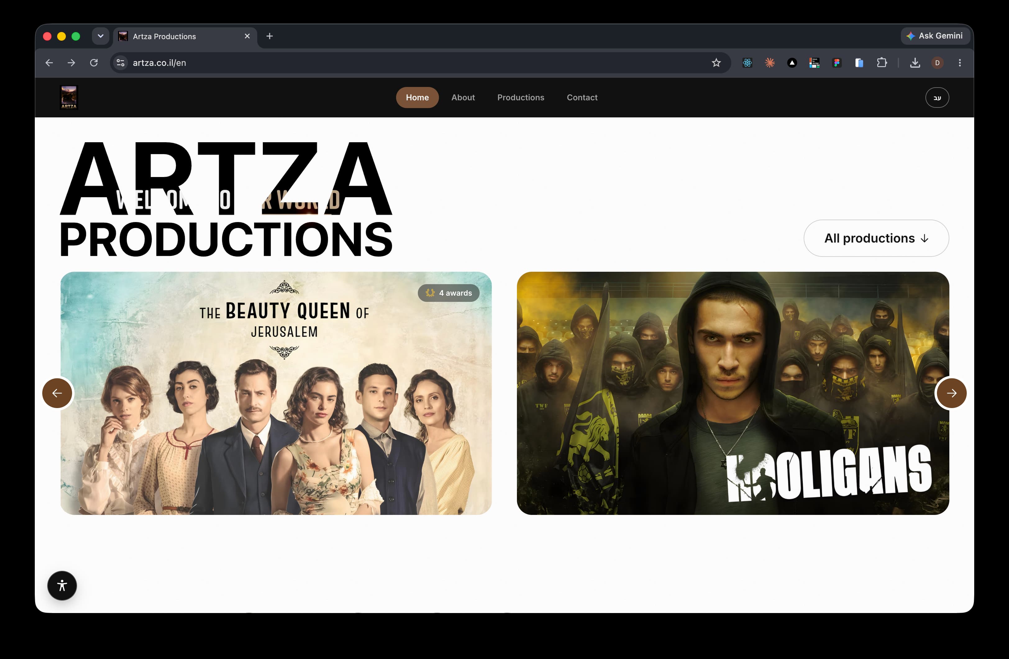
Artza Productions is a Tel Aviv-based TV production house. I designed and built their bilingual site around one constraint: their work is the loudest thing on the screen, and every design decision after that is a frame. A custom CMS gives the team the same visual clarity when editing and publishing their productions.
Art Direction · Web Design · Product Design · Frontend Engineering · 2026
 https://artza.co.il/en
A production company’s website should frame the work, not compete with it. The design stays intentionally restrained, using near-black surfaces, one accent color, and generous space so the key art always leads.
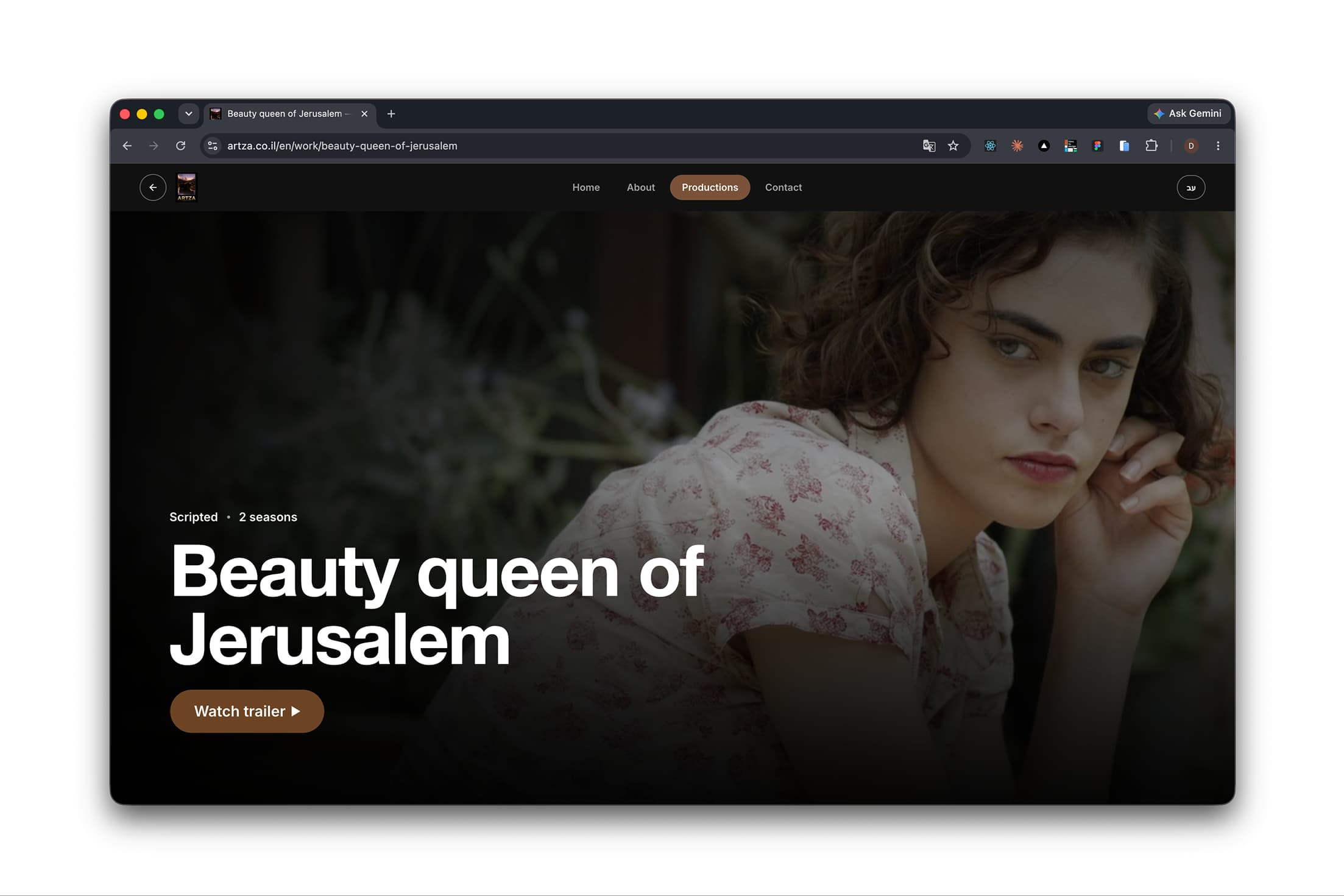
“When focus on the work itslef, the ui becomes a part of the company nerative.”
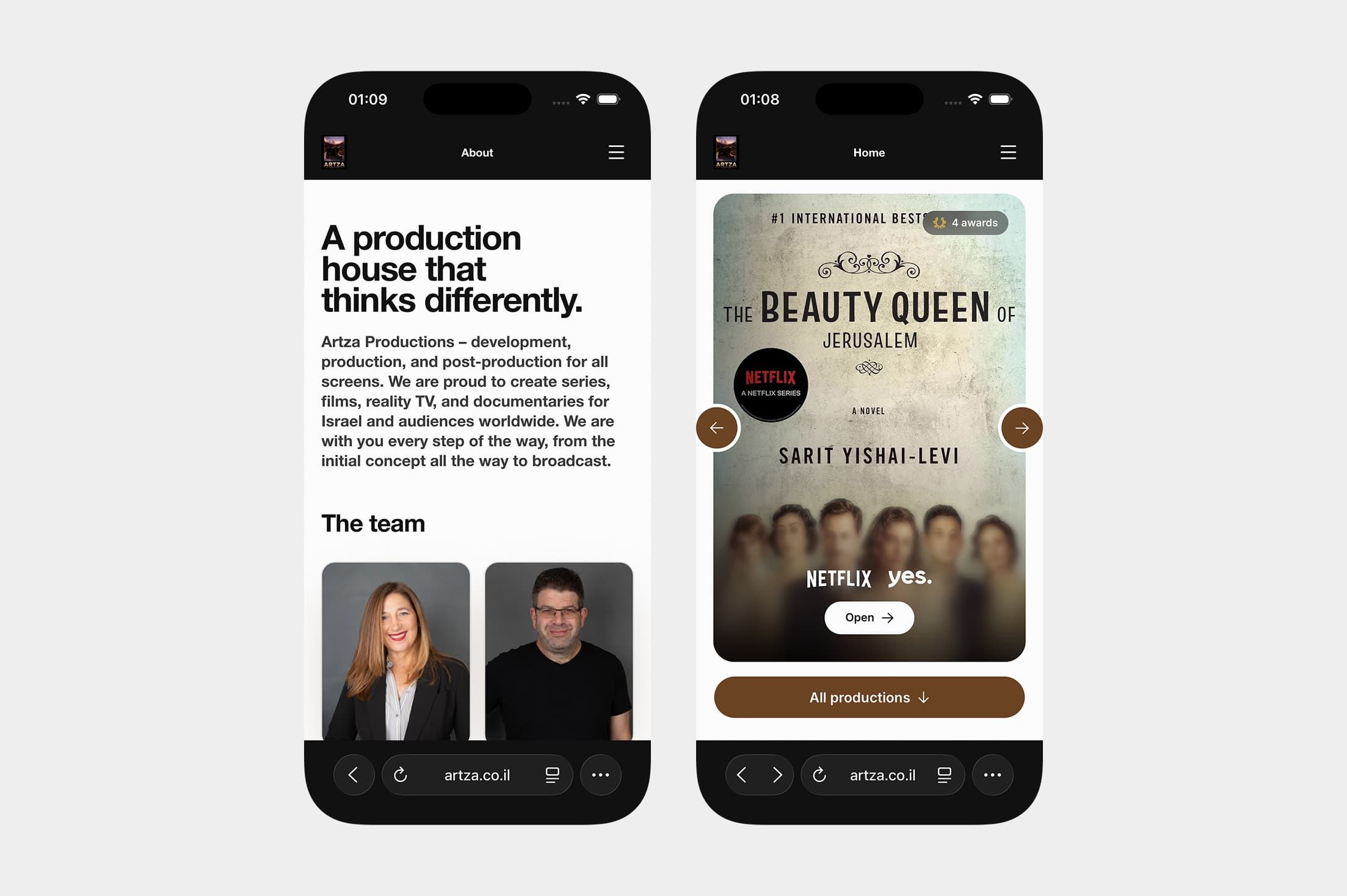
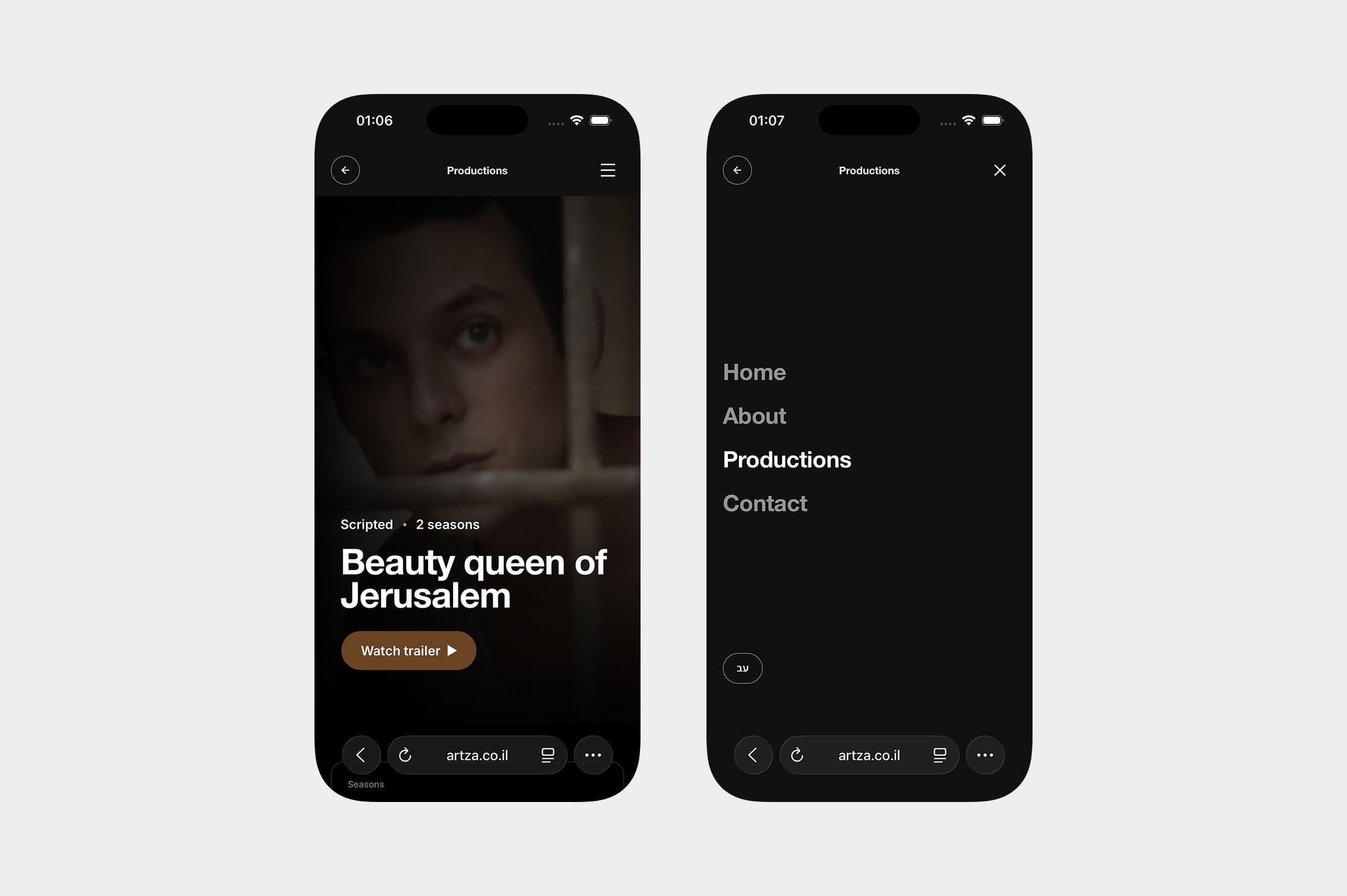
Mobile is a different composition, not a squeezed one. On the phone the poster becomes the whole screen and the chrome collapses to a single row, so the first thing in the viewport is always the work. Navigation lifts into a full-screen overlay rather than a cramped dropdown. The same restraint, at a size where restraint matters more.
Micro interactions
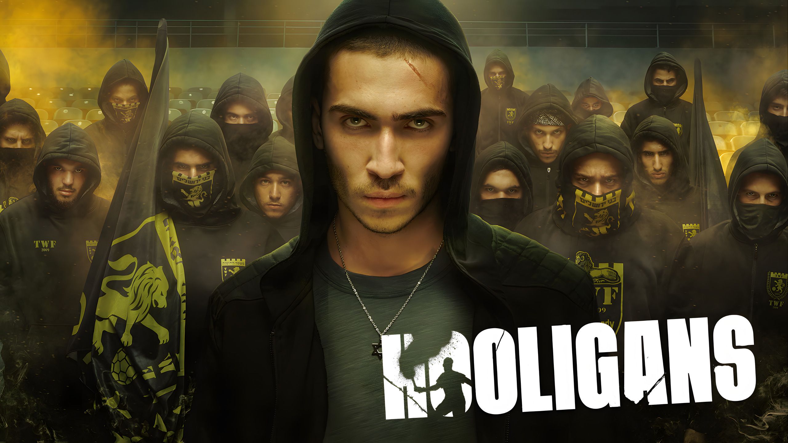
Hooligans
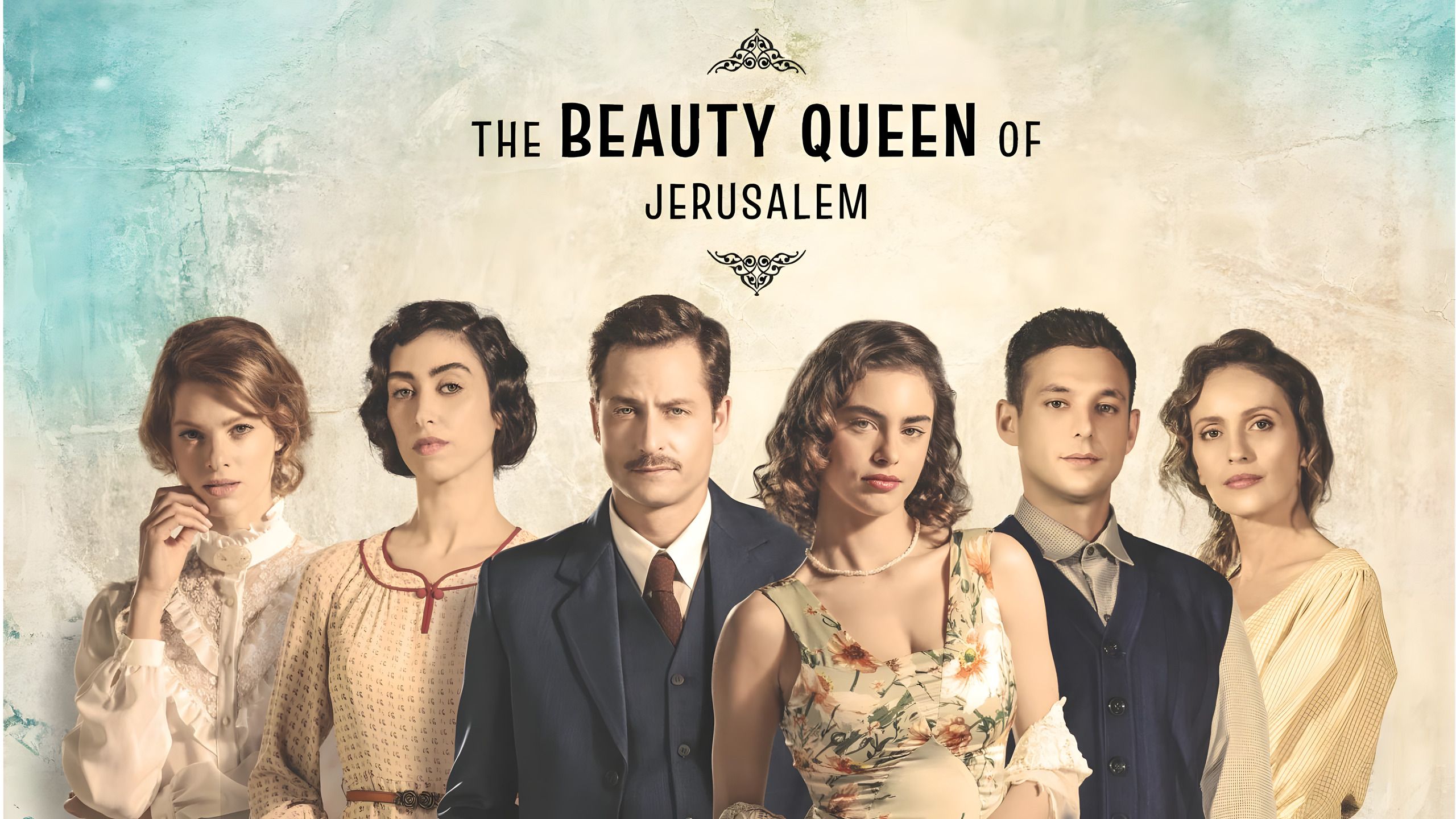
Beauty Queen of Jerusalem
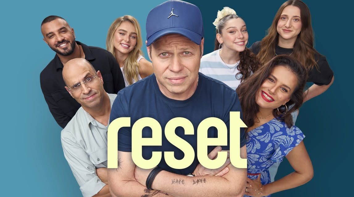
Reset
Design & stack
One family, six steps
A single fluid scale, with no ad-hoc sizes
Near-black · warm brass
One accent, and only for actions
Path-based i18n, mirrored
/en and /he on the same grid, flipped
Next.js · React 19 · TypeScript · Tailwind v4
Behind the website · Artza CMS
From files to the work itself
Artza's old CMS made the team work with files. I designed and built a visual editor that lets them recognize the productions, choose the images and understand what happens next.
Design & development · Artza Productions · 2026
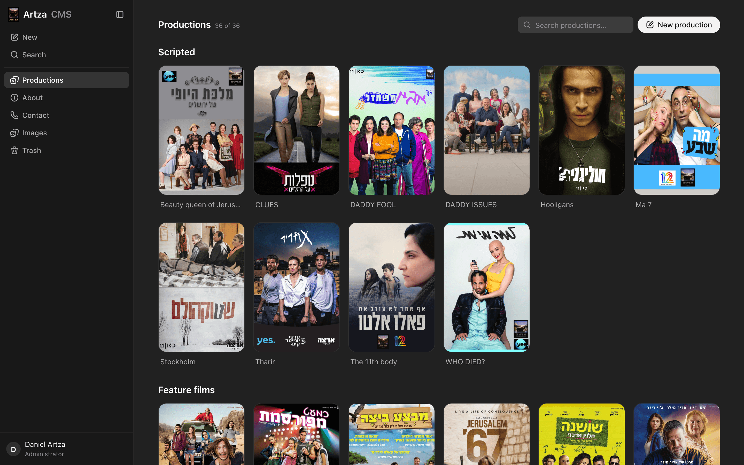
01 / A catalogue of stories
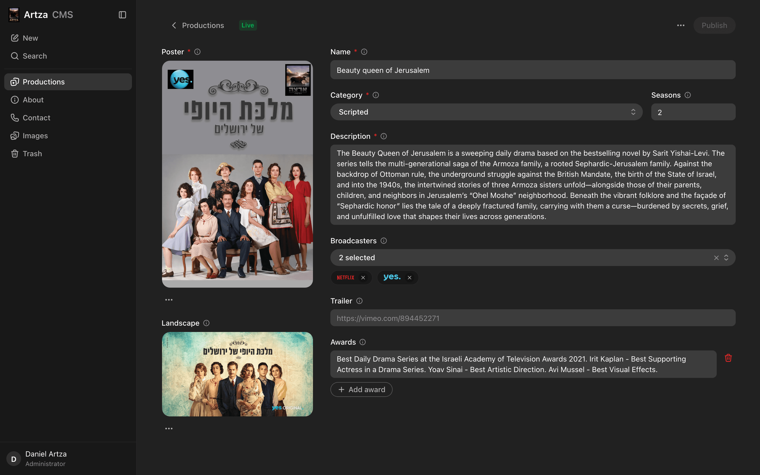
02 / The work, ready to edit
The starting point
They knew the work. The interface made it unfamiliar.
The previous system was old and focused on files rather than images. Working with it felt uncomfortable and unintuitive. My goal was straightforward: make it easy for Artza's managers and secretary to understand. I designed and developed both the website and its CMS, bringing the visual language of the work into the editing experience.
Previous experience / Files first
- Find the right file
- Work out what it contains
- Connect it to the production
A conceptual illustration of the file-oriented workflow, based on my account. Not a screenshot of the previous system.
New experience / The work in view

Hooligans
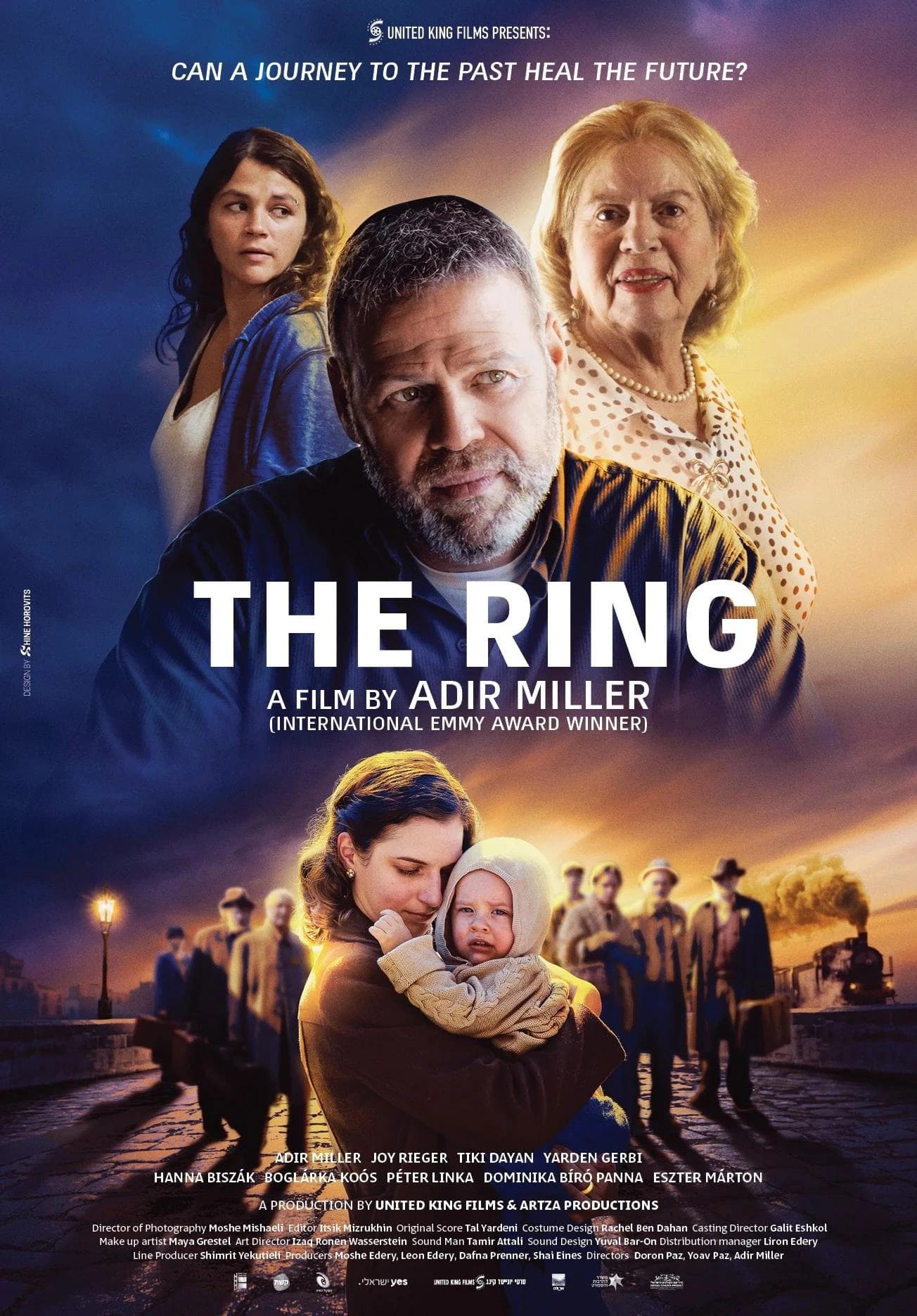
The Ring
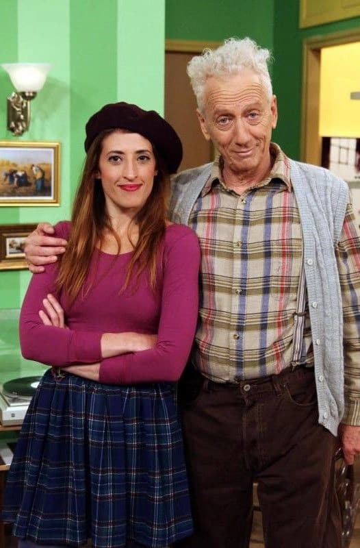
Clumsy Clark
Recognize the production before opening it. Keep its name visible, and use images as the starting point.
36
Productions in the source catalogue
6
Categories that give the grid structure
3
Publishing states, with separate field validation
01 / Find the work
The title belongs below the poster
A treatment that looks good on one calm poster can fail across a full catalogue. I explored four card treatments against busy artwork and dark posters.
Card explorations
Chosen: readable names, untouched artwork.

A reconstruction of the card explorations, using the CMS artwork. Hover or focus a poster to compare the treatments.
The decision
Keep names visible at rest. A caption leaves the artwork intact and lets the editor scan without hovering over every card.
A
A bare grid
Fast to build. Finding one item means scanning a wall of posters.
Rejected
B
Search and filters
More controls, but the catalogue's shape disappears into a flat list.
Rejected
C
Groups and search
Categories stay visible as sections. Search answers the known-title case.
Chosen in the prototype
Drag within a category to arrange the work. Moving to another category is a content edit, so dragging cannot silently change it.
02 / Edit the content
A poster is not a text field
The media stays on one side, with the information it belongs to alongside it. Each field follows its own content instead of inheriting the same generic input.
Images are reusable
Pick from the library by shape. Productions reference the file, so alt text is maintained in one place.
A URL is enough
The trailer field derives the provider and video ID. Editors supply a link, not machine-managed metadata.
Fields respond to context
A feature film has no seasons. The control disables for that category instead of asking for a meaningless value.
03 / Tell the truth
Saved does not mean live
The important bug was a quiet one. After saving an edit to a live production, the draft was clean, but the published version was still behind. A date alone could not describe that state.
Interactive state explainer
Editor
No unsaved changes.
Published version in this explainer
Beauty Queen of Jerusalem
Saving a draft leaves this version untouched. Publish commits the edit and makes this version current.
The draft and published version match. Try changing the title, then save it as a draft.
A simplified explanation of the CMS state model. This demonstration does not publish to the Artza website.
Never published
No live version yet
A new production can be saved incomplete. Going live is a separate action.
Pending changes
The site is behind
Unsaved edits and saved, unpublished edits both need an honest status.
Live
Everything is current
Only a clean, published record with no pending changes has nothing left to publish.
A separate gate
Completeness is a field concern, not a publishing badge. Poster, name, category and description are required to publish. Incomplete work can still be saved.
One Publish action saves the edit and changes its publication state. Loading stays inside the button; success is confirmed there and in a toast.
04 / The small decisions
Recovery has a state, too
Undo and restore look similar. They make different promises.
Undo returns you exactly where you were
The delete action keeps its own inverse, including the production's publishing state.
Restore does not silently republish
A previously live production returns from the trash with changes pending. Publishing is still an intentional action.
The image must survive the restore
A production in the trash still counts as using its poster. The library prevents deleting an image that something holds.
Removing a production is recoverable. Bringing it back does not skip its publishing state.
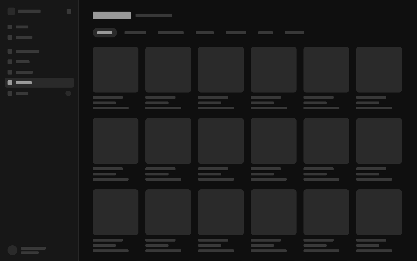
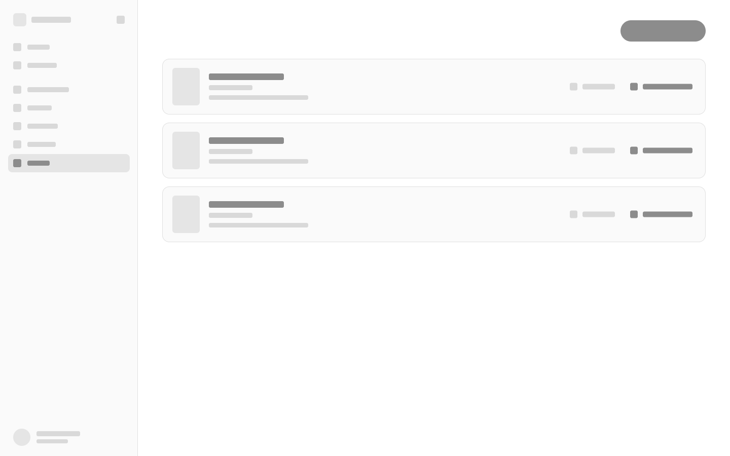
Structure before surface
The same model, across the screens
The wireframes show how browsing, editing, image reuse and recovery each get a focused space.
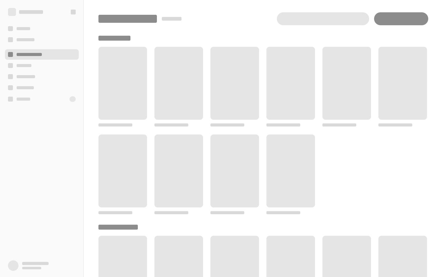
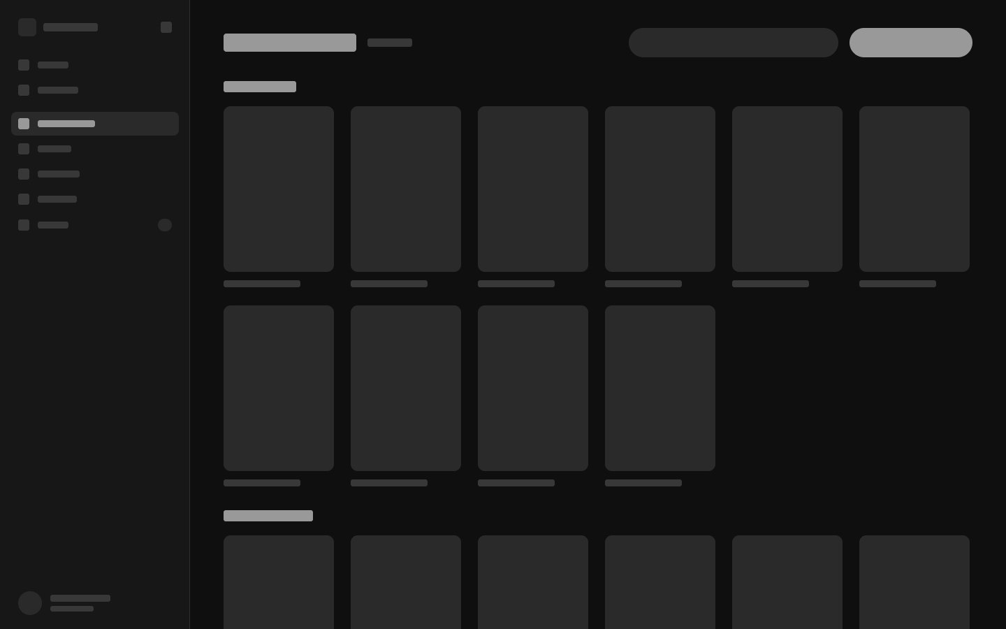
01 / Productions
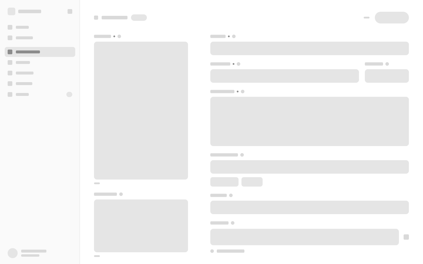
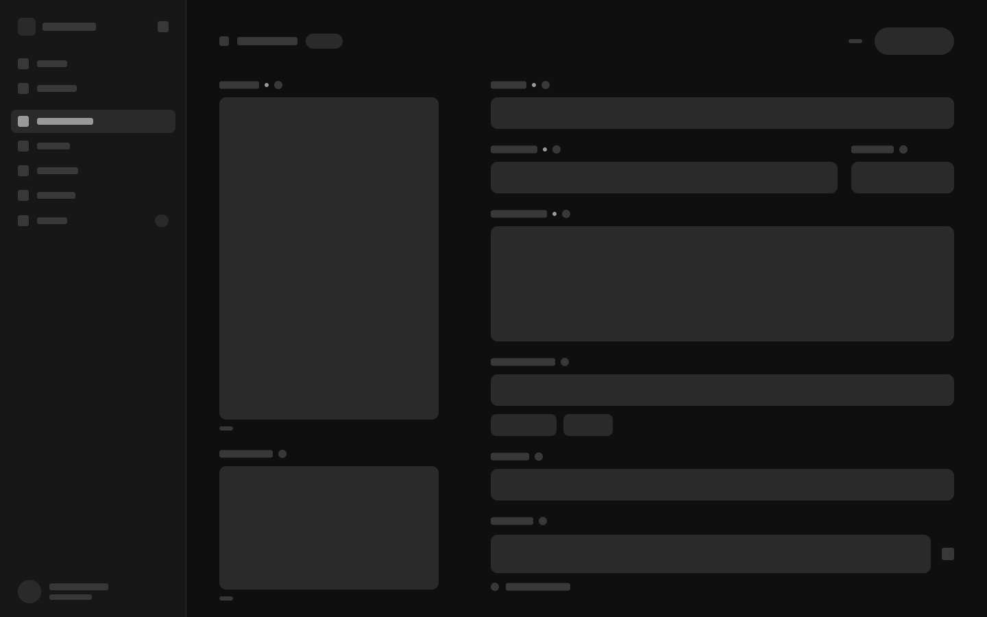
02 / Editor
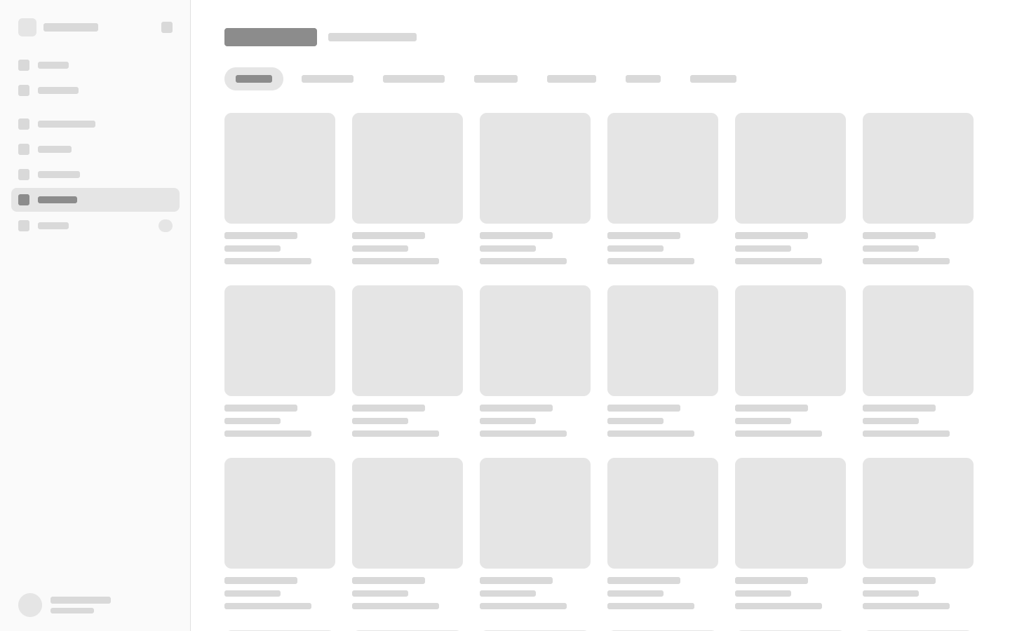
03 / Images
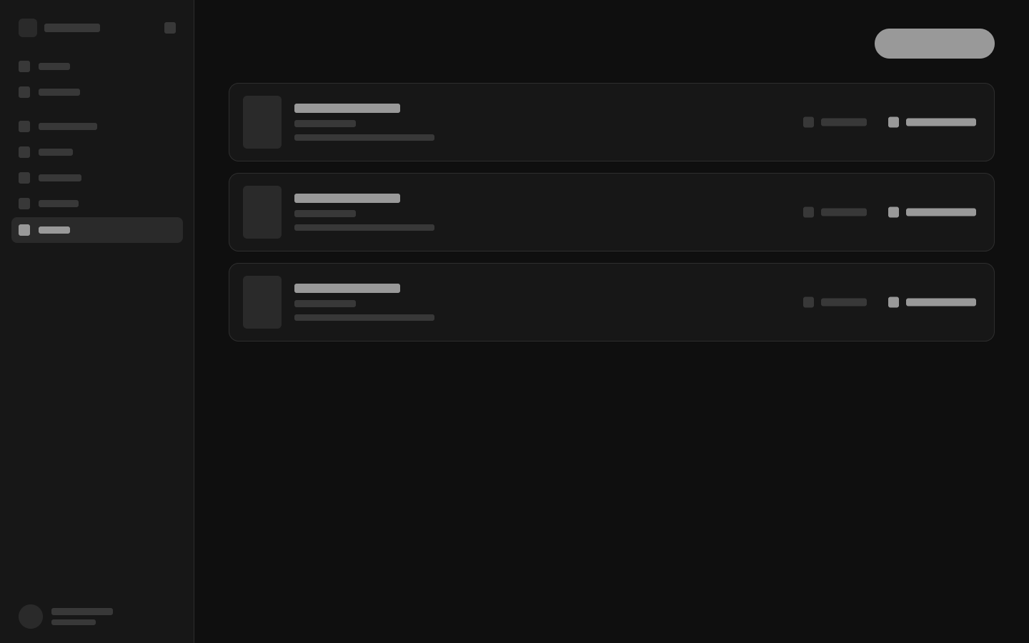
04 / Recovery
Feedback from Artza
Less time operating the system. More time working with the content.
Artza's managers and secretary were able to edit and publish faster. The feedback was qualitative, but directly connected to the original goal: make the system easier to understand.
The result
Faster editing. Faster publishing.
Qualitative feedback from the Artza team.
What I designed and built
The website and CMS, from visual direction to the editing interactions and implementation. The system brings the content closer to its controls and makes publishing state explicit.
What the evidence tells us
The team reported a faster workflow. A timed before-and-after study is not available, so this case study does not turn that feedback into a percentage.
Try the interaction model
The demo uses in-memory data and simulated writes. It lets you explore the editing experience without publishing to the website.
 WhatsApp