Reduce prototype creation
A creative tool that turns a prompt into a runnable prototype in the thread, so a designer can feel a flow before committing to build anything.
Product Design · Generative UI · Frontend Engineering · 2026
 https://generative-ui-psi.vercel.app/
Prototyping one flow costs more than the question is worth
Most design questions are small. Does this list feel right to tick through? Is three steps too many? In the AI tools designers already have, answering one of those means scaffolding a whole project to see a single screen move, or generating an image of it, and an image cannot tell you how the thing feels under your thumb. Either way the cost of asking is higher than the cost of guessing, so people guess.
The shortest distance between a prompt and something you can operate
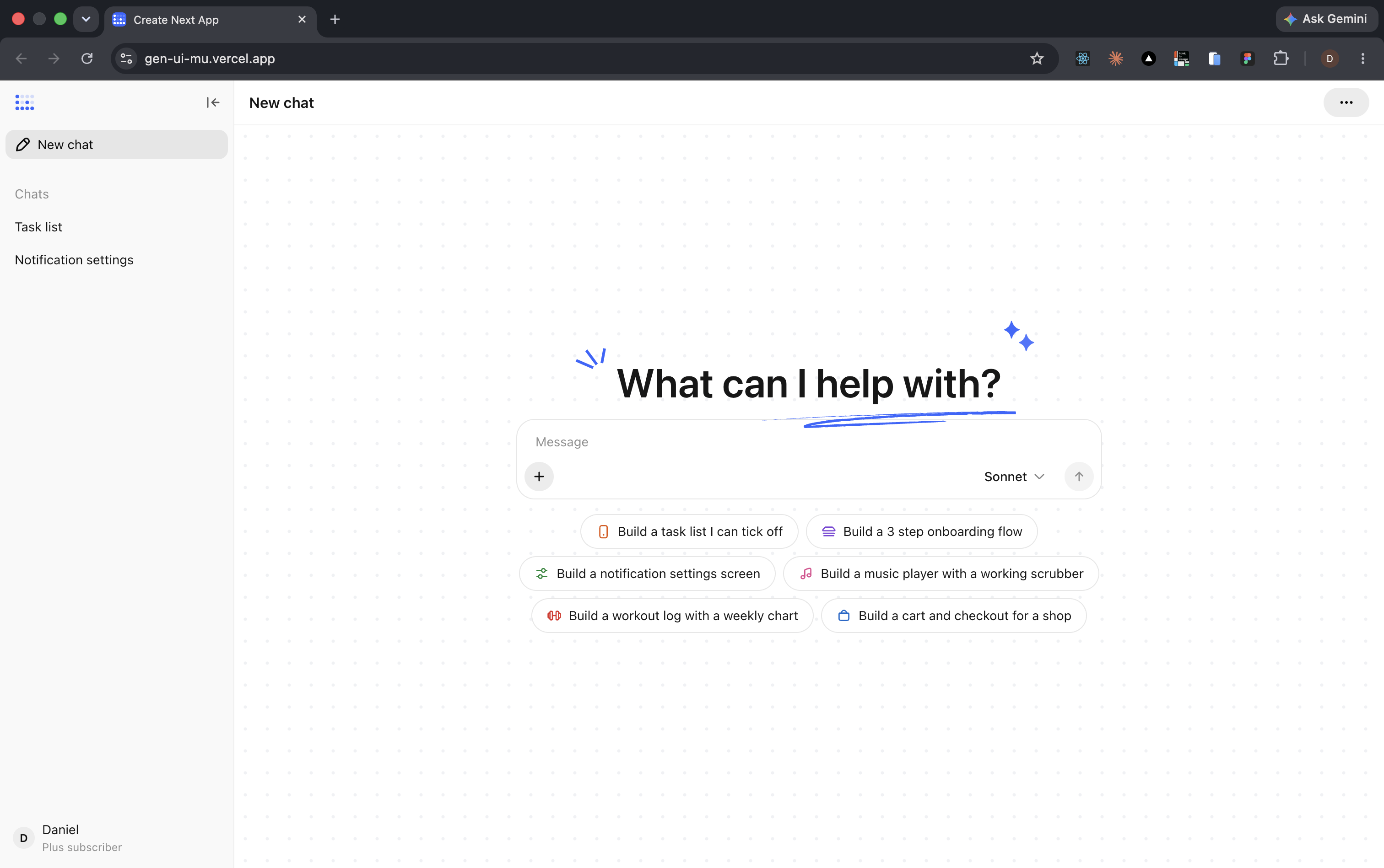
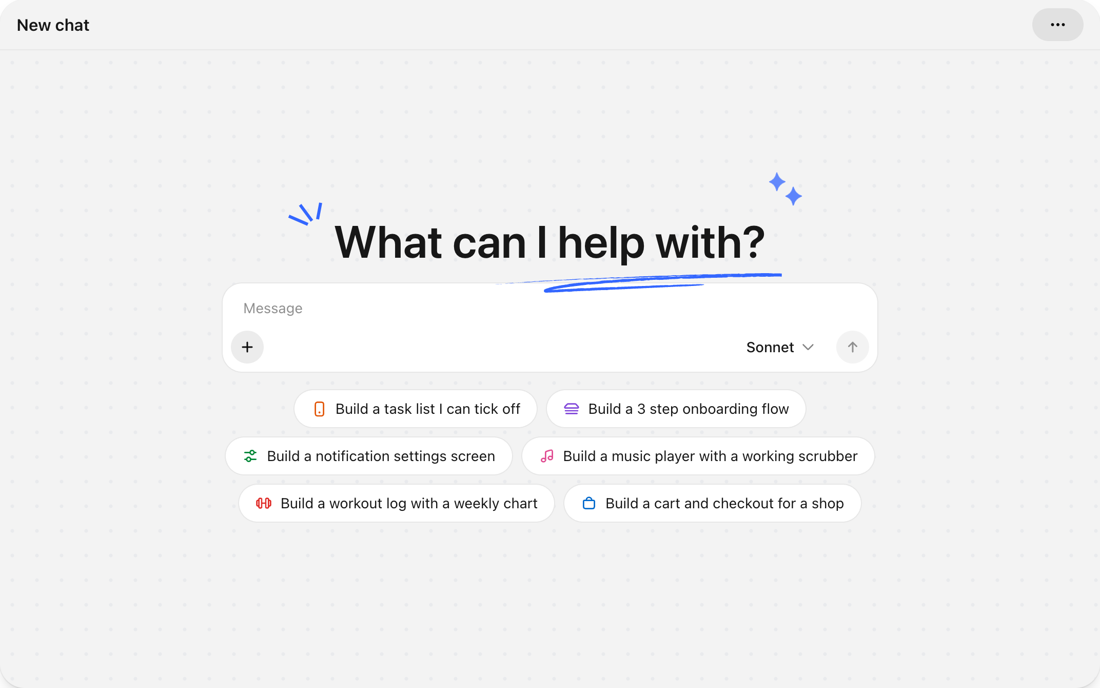
I wanted the answer to arrive in one move. Open the tool, say what you want in plain language, get something running. No repository, no install, nothing to tear down afterwards. The blank state carries six starting points for the same reason a good brief does: the hardest part of asking is the first sentence, so the tool offers one. What comes back is not a picture of a prototype. It is the prototype, running in the thread inside a phone frame, ready to be tapped where it lands. Ask again and the next one arrives underneath, so a session reads as a series of attempts rather than one artefact you keep overwriting.
Built against real prompts, not a spec
I wrote the stack with Claude Code, wired to Anthropic's Sonnet and Haiku models, and judged every change against an actual generated reply rather than a design file. The editor and the running thread stayed side by side throughout. That is also why the problems in this study are the ones the tool ran into rather than the ones I predicted.
One minute is still a very long time
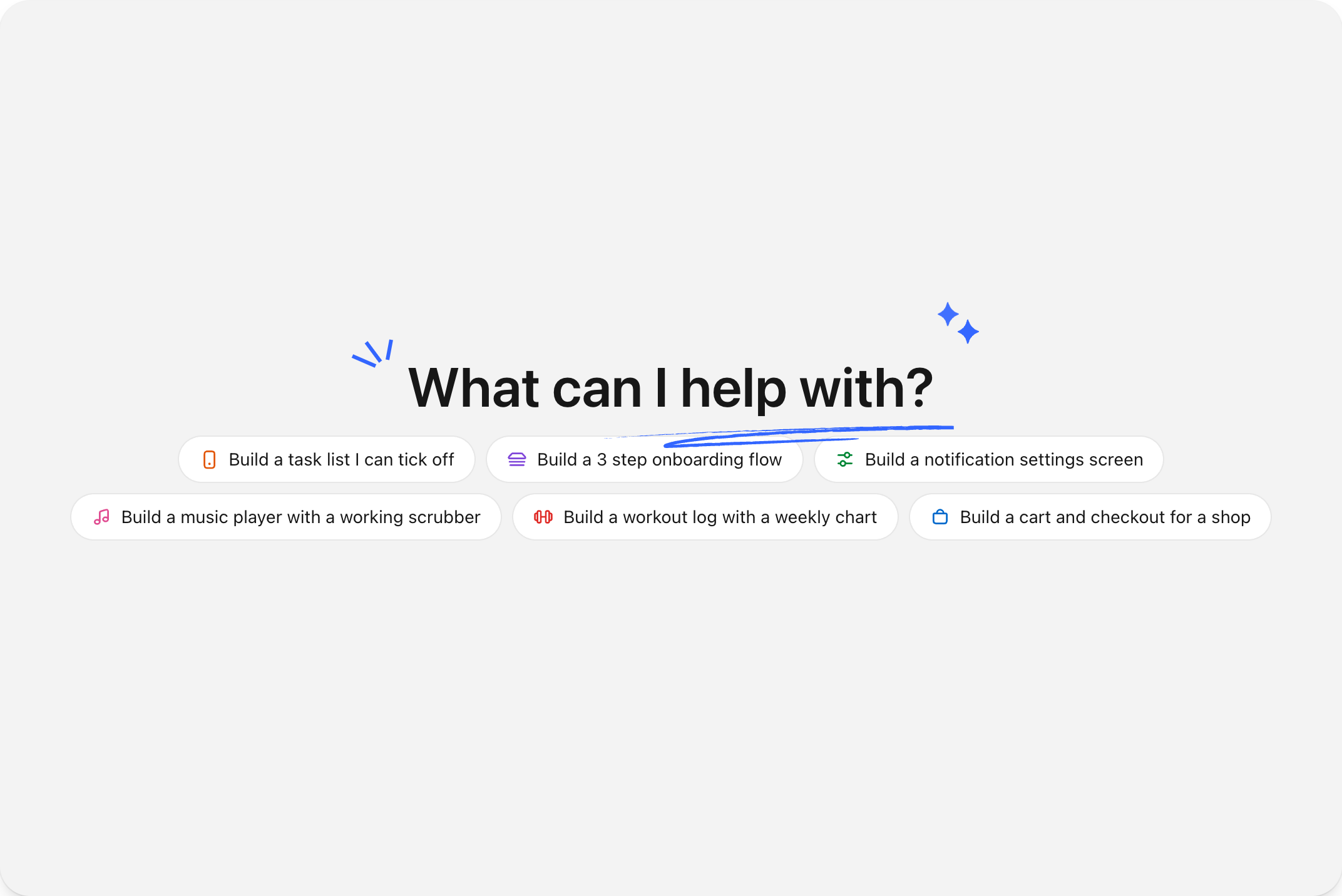
Generation got fast. It did not get comfortable. Even at around a minute, that minute is dead air, and dead air in a creative tool fills up with doubt: whether it heard you, whether it is working, whether starting over would be quicker. The send control turning into a stop control was the only thing on screen that changed. The speed problem had become a waiting problem, and shaving seconds would not have fixed it.
What a wait is allowed to be
Before trying anything I went back to the established response-time thresholds and the patterns used for long-running AI tasks. The guidance is consistent. Acknowledge the action immediately. Show that work is continuing. Say what is happening in plain language. Keep recovery within reach. The longer the wait, the more specific the feedback has to become, which rules out a spinner: a spinner is the same sentence no matter how long it is said for.
Three ways to fill the wait
The first attempt is not in the recordings below, because measurement killed it. I streamed the generated source into the card while it was being written, on the reasoning that code is the honest thing to show while code is being written. The API does not deliver it that way. It sends the whole tool call in one burst near the end, so on a seventy second turn the first real code landed at sixty nine seconds: an empty pane for the entire wait, then full for two. After that I built the waiting state three more ways and watched each over a full generation rather than as a static frame. A minute is long enough that anything repetitive turns into wallpaper, and long enough that anything busy turns into noise.
Text and motion answer different questions
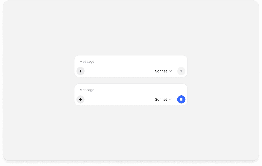
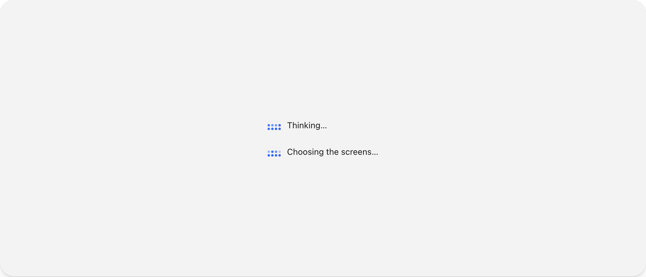
Neither half carried it alone. The motion says it is still happening; the text says what is happening. What shipped runs both: inside the frame a torus turns above a single shimmering line naming the file being written, and it stays blank until there is something true to put in it. Outside the frame the turn keeps a trace, each finished step collapsed with the time it actually took. Thinking, choosing the screens, wrote App.tsx in fourteen seconds. Nothing in it is invented; every label and duration is measured. Once both were on screen the same minute stopped reading as a stall, because a wait you can watch is a different length from a wait you cannot.
Then point at it and change it
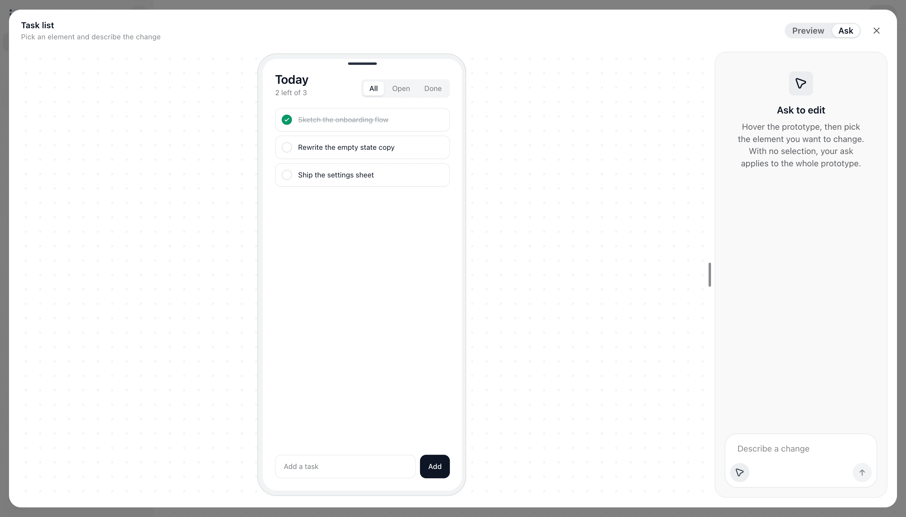
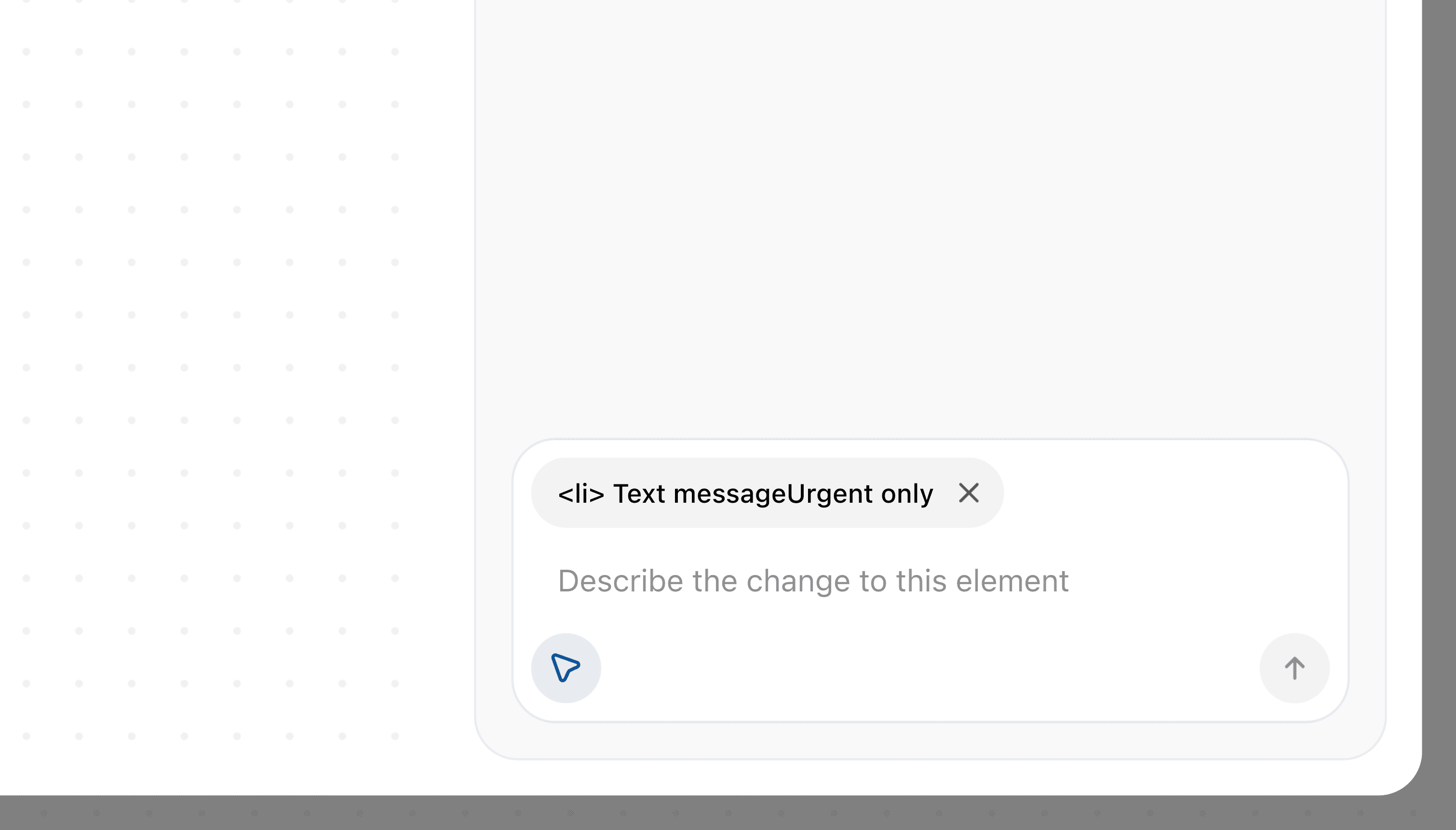
Generating the right thing first time is not the interesting case. The interesting case is the one where it is nearly right. Open a prototype at full size and it has a second mode. Preview lets you use the screen normally; Ask switches the same running screen to element picking and docks a composer beside it. The two are exclusive on purpose, so a click never both operates the prototype and selects a target. What travels with the request is the element's semantic path rather than a coordinate, so the model is told you mean that list row inside that list, and with nothing picked the same sentence applies to the whole screen. The amendment is written back over the existing result instead of arriving as a new turn, which keeps the thread a record of what you asked for rather than a log of corrections, and an interrupted or failed edit puts the previous version back.
Take the code, keep the thread
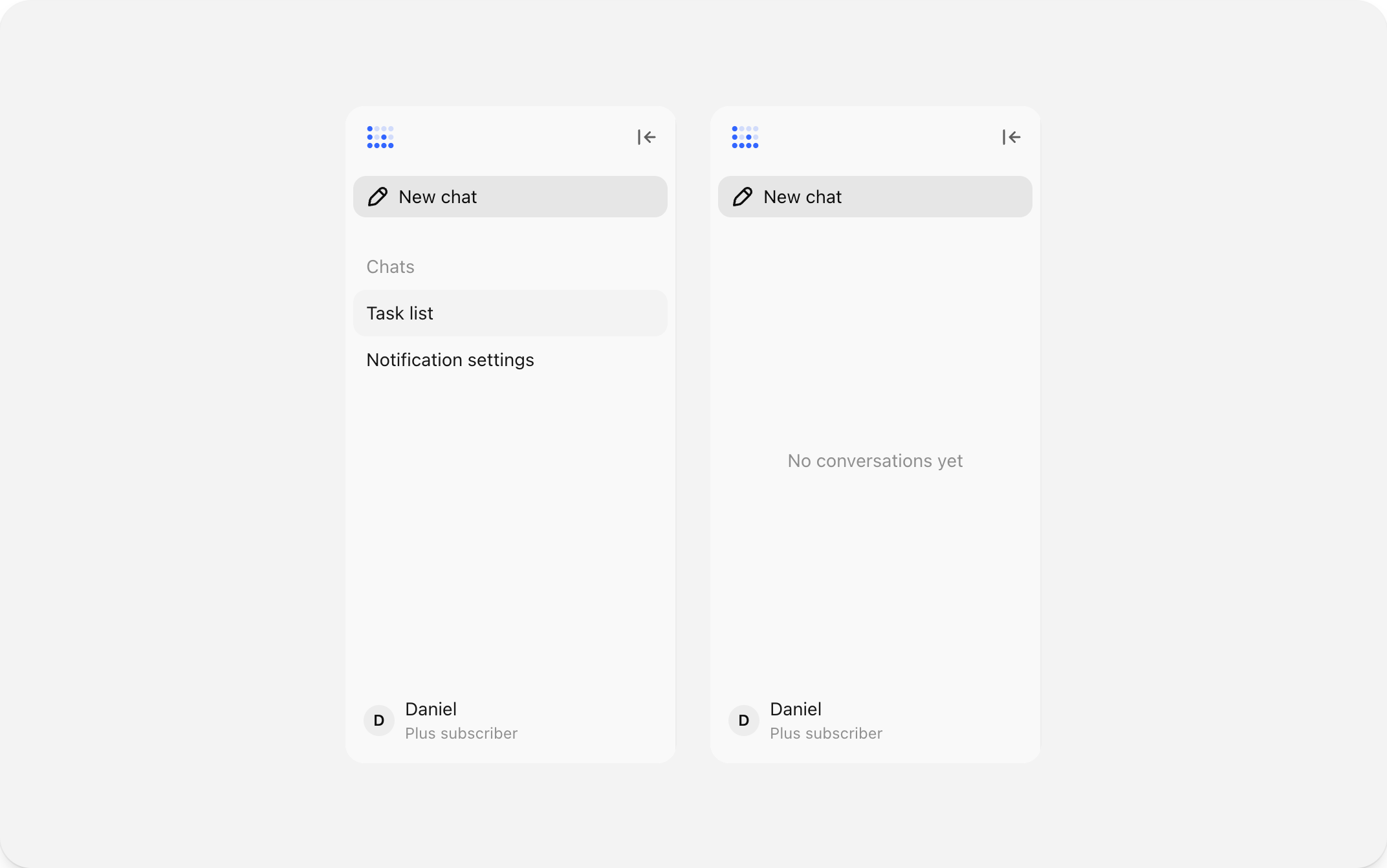
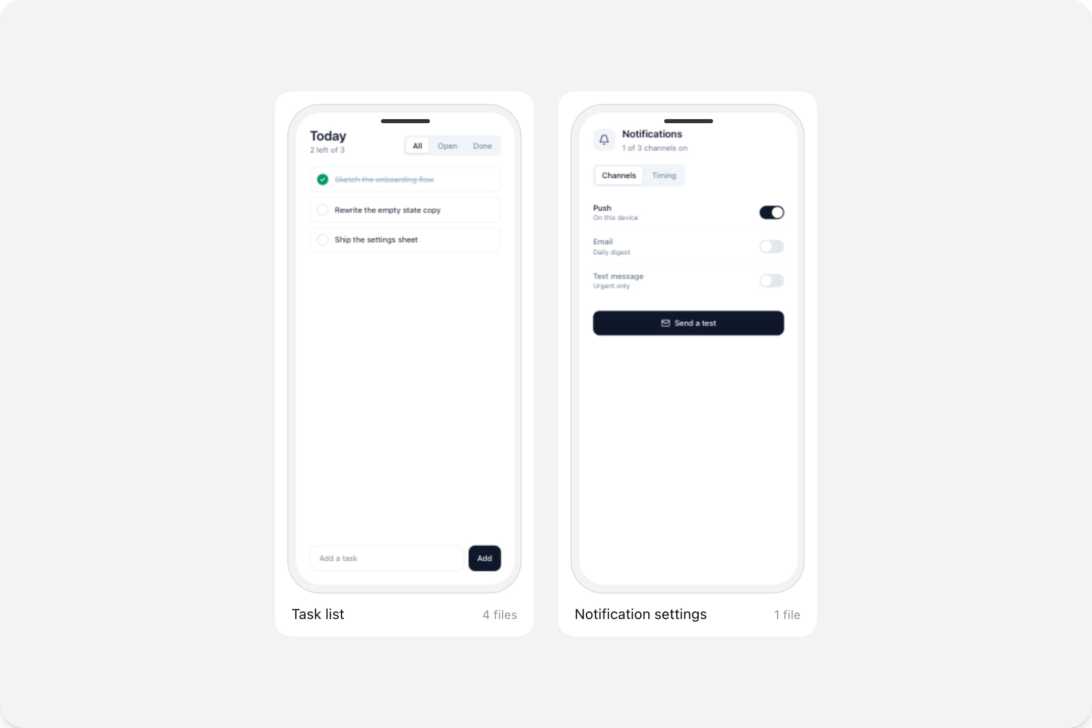
A prototype that only exists in the tool is a demo. Every result copies out as React from where it sits, so the thing you just felt is the thing you hand over. The threads stay in the sidebar under the prompt that made them, which is what turns a session into a record of what you tried rather than a single surviving file.
but wait, what if its not the "happy path"?
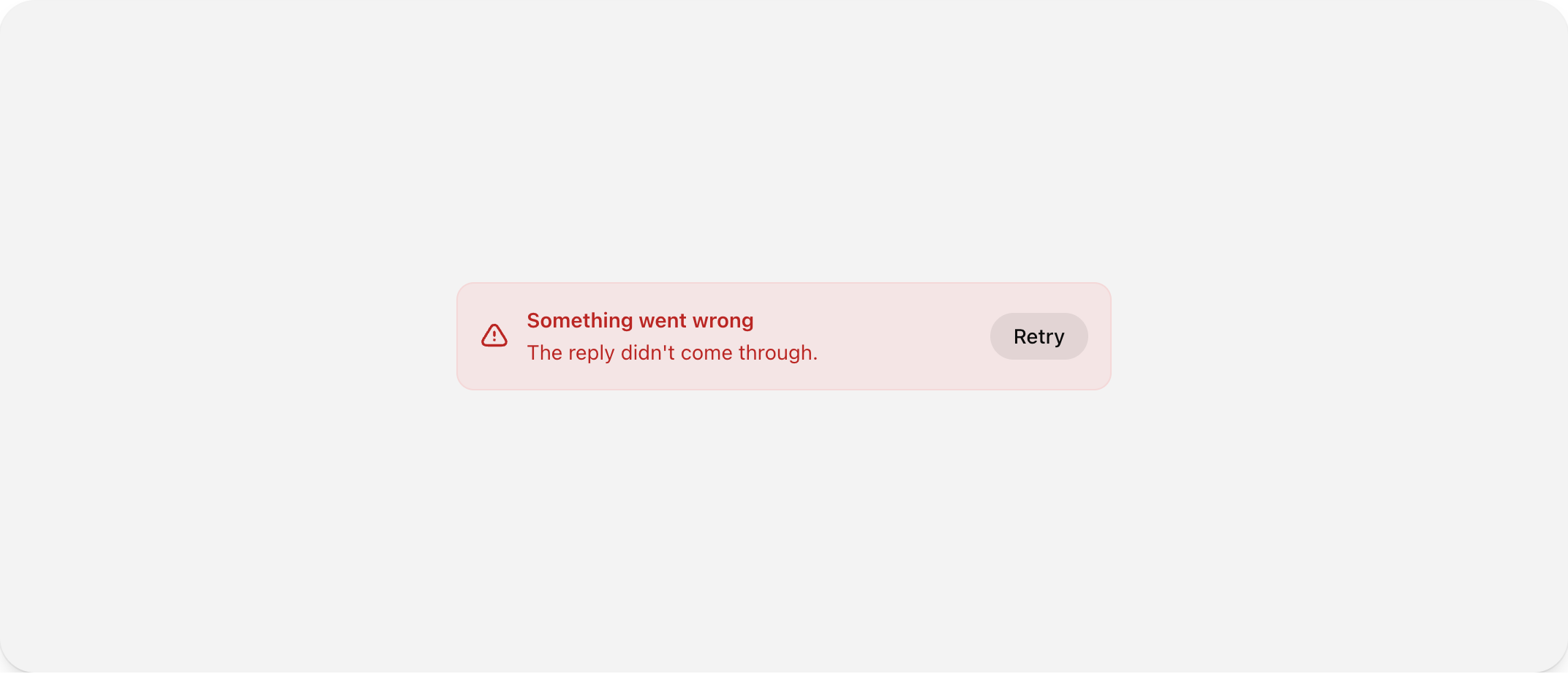
A generative tool spends a real share of its time not succeeding, so the failures had to be designed rather than left to an error boundary. A failed reply stays in the thread as a turn of its own, in its place in the conversation, with the request still above it. Nothing is thrown away and nothing has to be typed again.
Generation can fail
The model might time out, return nothing, or lose the connection halfway through. The interface needs to explain what happened without making the user start the conversation again.
The result can be broken
A prototype can finish generating and still fail at runtime, render an incomplete interface, or ignore part of the prompt. A finished state is not always a successful state.
The user can lose their progress
A refresh, closed tab, or interrupted session can erase the context behind the result. Recovery has to preserve the thread and make the next action clear.
The rest of the interface
The rest of the surface, in the order you meet it: what a finished turn looks like, where the history lives, how results accumulate, how a change is aimed, how the wait announces itself, and what is left standing when a reply fails.
What I would keep from it
Speed and patience are different problems
I spent the first half of the build making generation faster and the second half making the same duration bearable. The second half moved the tool further. Once a wait is honest about what it is doing, it stops being measured in seconds.
Nearly right is the normal case
Designing only for the reply that lands perfectly leaves the user with one move: ask again and hope. Letting them point at the part that is wrong turns a rejected result into a starting point, and it is the feature I would build first next time.
A prototype has to be operable to be worth anything
The whole project rests on the difference between seeing a flow and using one. Everything that survived the build (running in the thread, opening at full size, copying out as React) exists to protect that difference.
 WhatsApp