See every take. Then touch the code.
A Mac app where your coding agent builds a few takes on a screen, from your real components. You pick one before anything touches your code.
Design and build · 10 days · Mac app · Shipped, 0.8 · 2026
The gap Sneak Peek closes
Design tools give options. An agent gives the real thing. Nothing gave both.
Six tools near the same corner
Each one gives part of it. This is where each one stops.
 What it givesA canvas for many options, drawn as pictures.Where it stopsWhat you compare is a drawing, not the running product.
 What it givesA canvas that publishes real sites.Where it stopsBuilt from Framer's own components, not from your repo.
 What it givesA working app from a prompt.Where it stopsA new codebase, and one result at a time.
 What it givesAI prototypes in a design system you import.Where it stopsIts own AI working on a copy, not your agent in your code.
 What it givesAn HTML and CSS canvas that agents write to over MCP.Where it stopsIt draws its own HTML. Your code components were still on its roadmap in September 2026.
 What it givesA canvas agents draw on, saved as an open .pen file.Where it stopsA design file beside the code, not the code running.
 What it givesYour real components, in several takes side by side.Where it stopsBuilt by the agent you already use, outside your repo.
Three tries to find a home for variants
The first two tries fixed the toolbar and hid the variants. The third came from exploring the sidebar in Figma and trying it as a clickable prototype before any code. I set the direction and made the calls, and Claude built the explorations, the prototype and the code.
Starting pointDidn't work
A segmented control in the toolbar
The first build listed every variant as a segment. It grew with each new variant until it pushed the rest of the toolbar into overflow.

Quick fixDidn't work
A menu that hid the variants
Claude swapped it for a fixed-width All variants menu. The toolbar stayed tidy, but seeing the variants took a click and switching took two.

DivergeExplored
Four directions for the sidebar
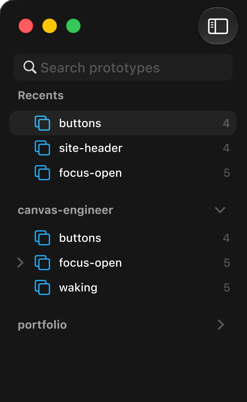
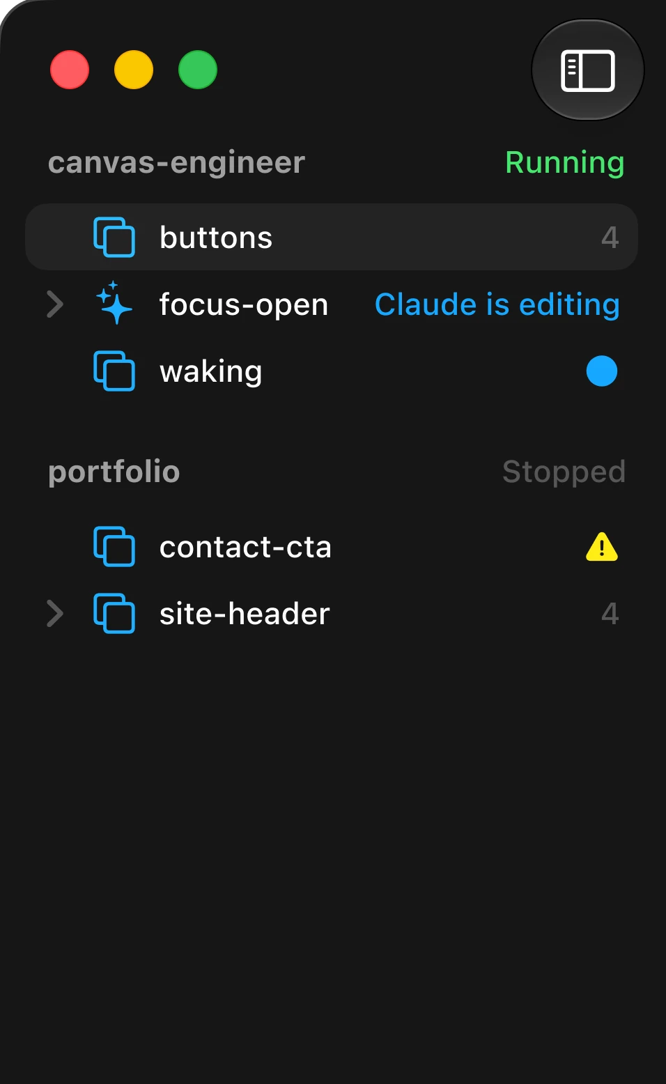
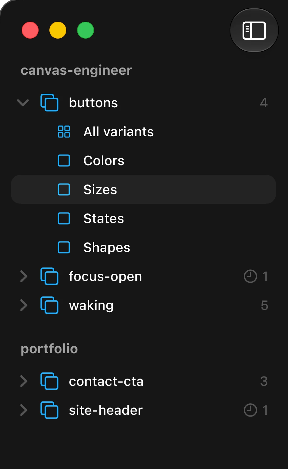
I asked for sidebar ideas, and Claude built four on the real window in Figma: search and recents, live status, variants nested under prototypes, and thumbnail previews.
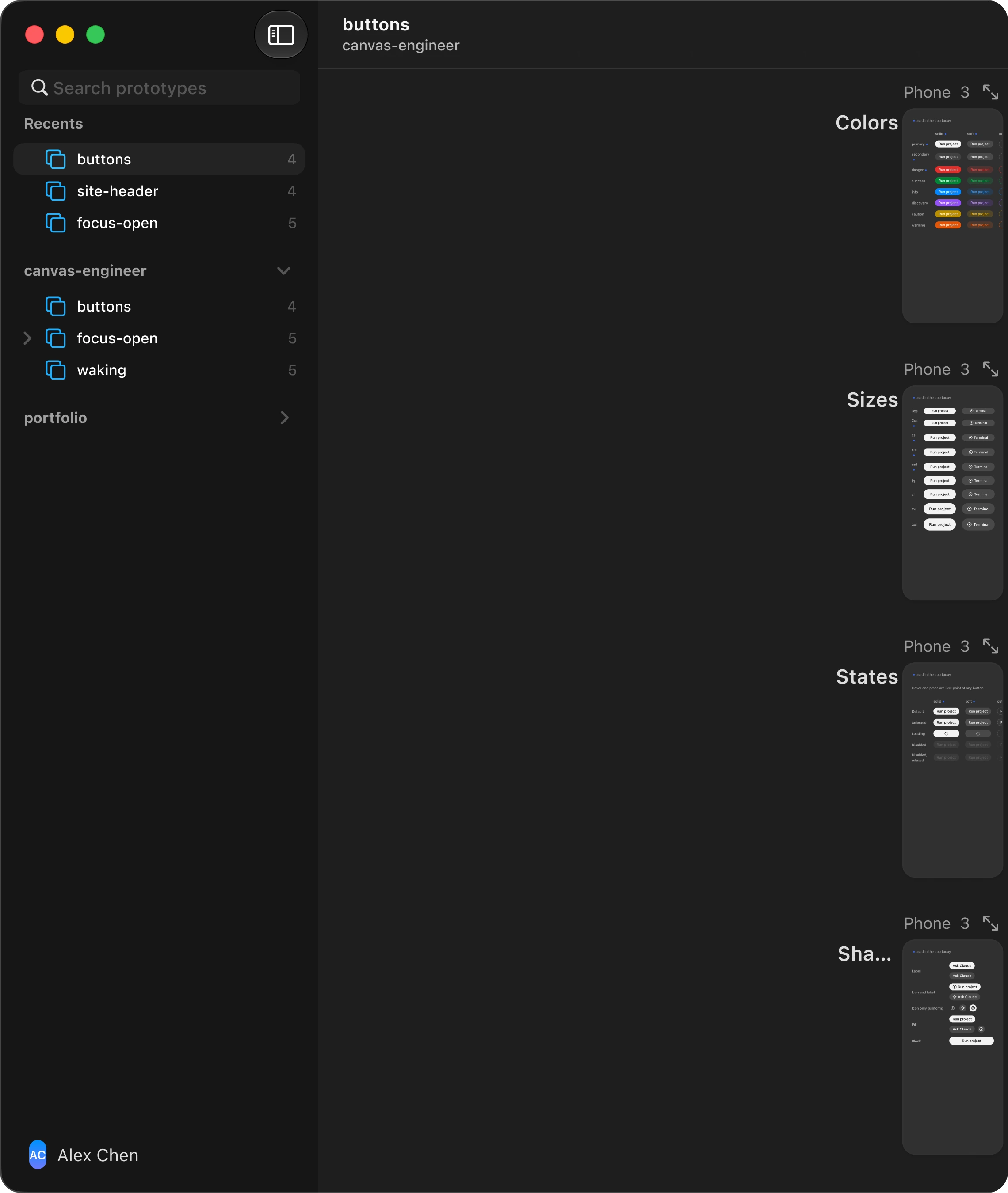
A · Search
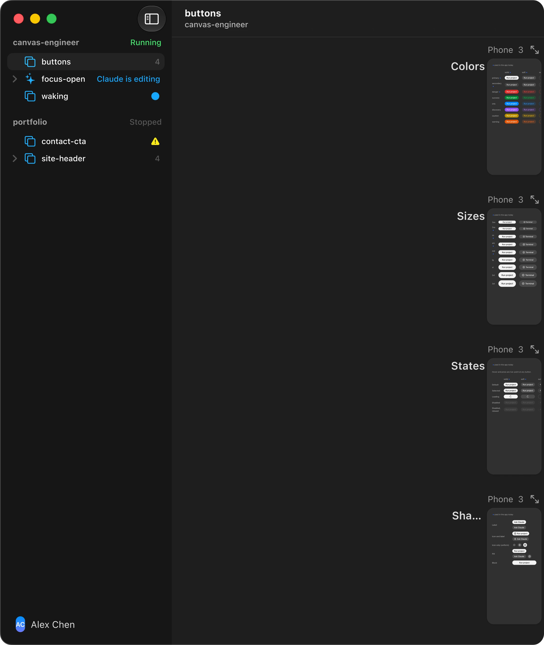
B · Status
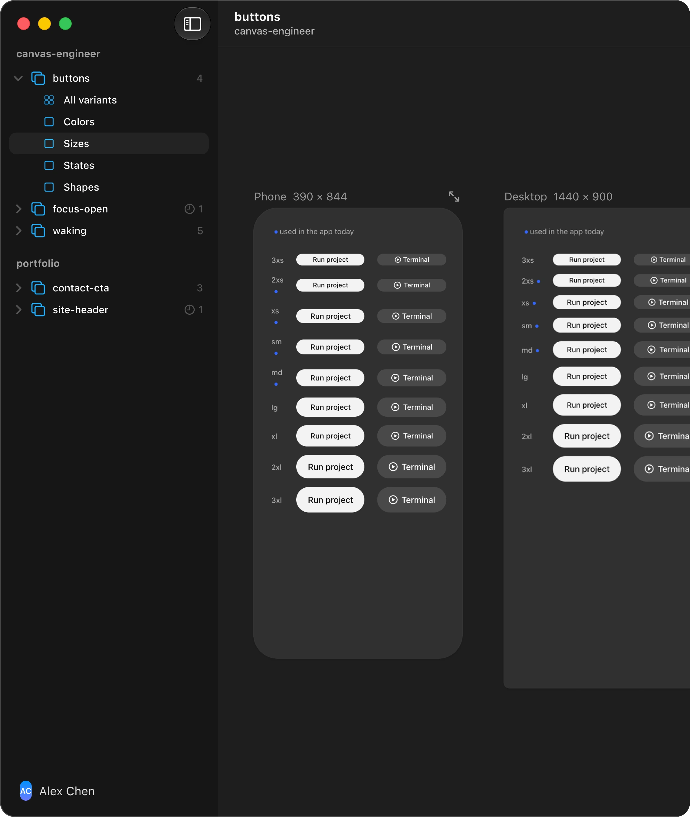
C · Nested
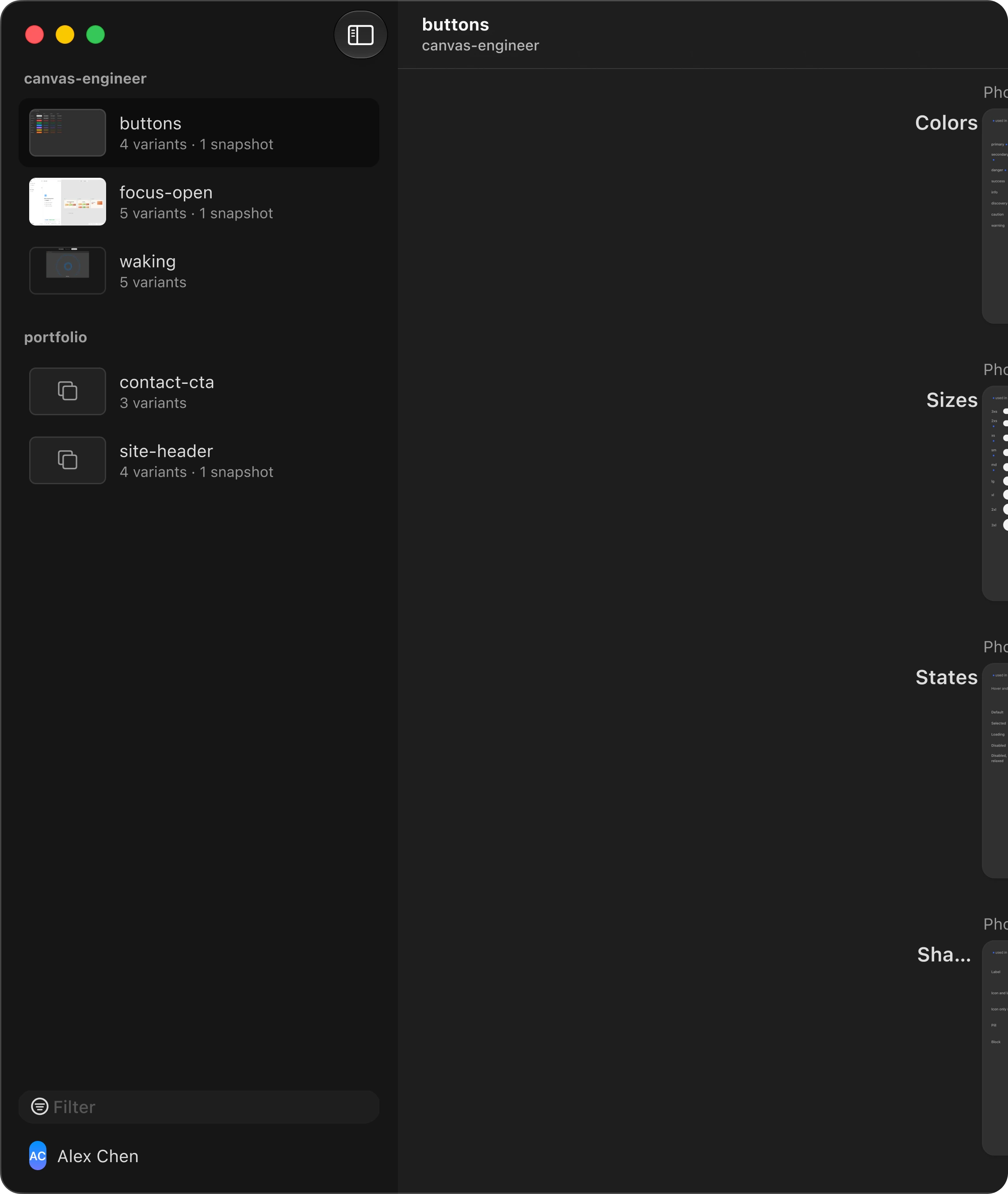
D · Previews
ConvergeMy call
C and D, combined
D's thumbnails were my favorite, but I wanted to talk it through before any code. Then I suggested keeping C's compact rows and putting D's thumbnails inside them. That became option E.
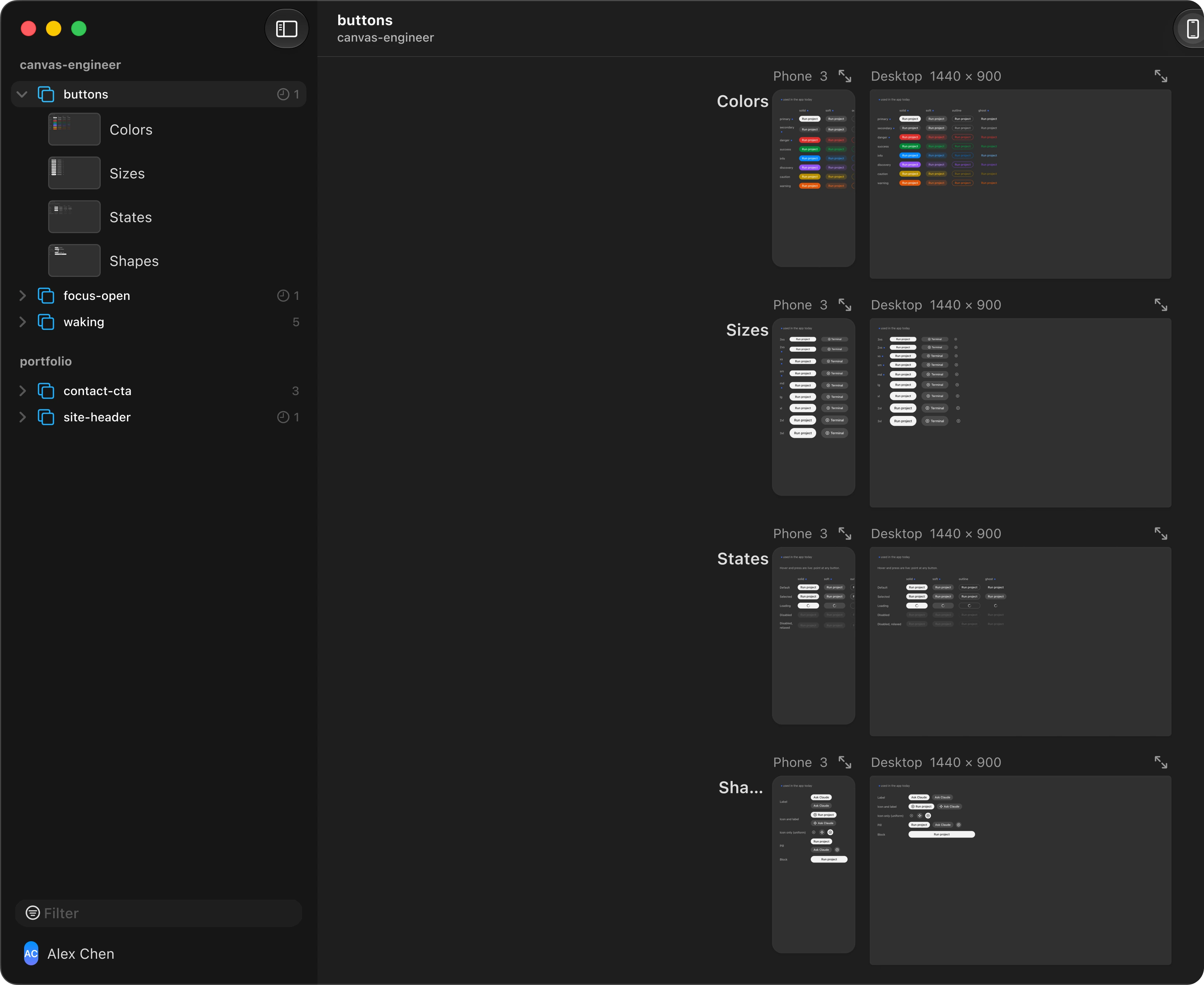
E · Prototype selected
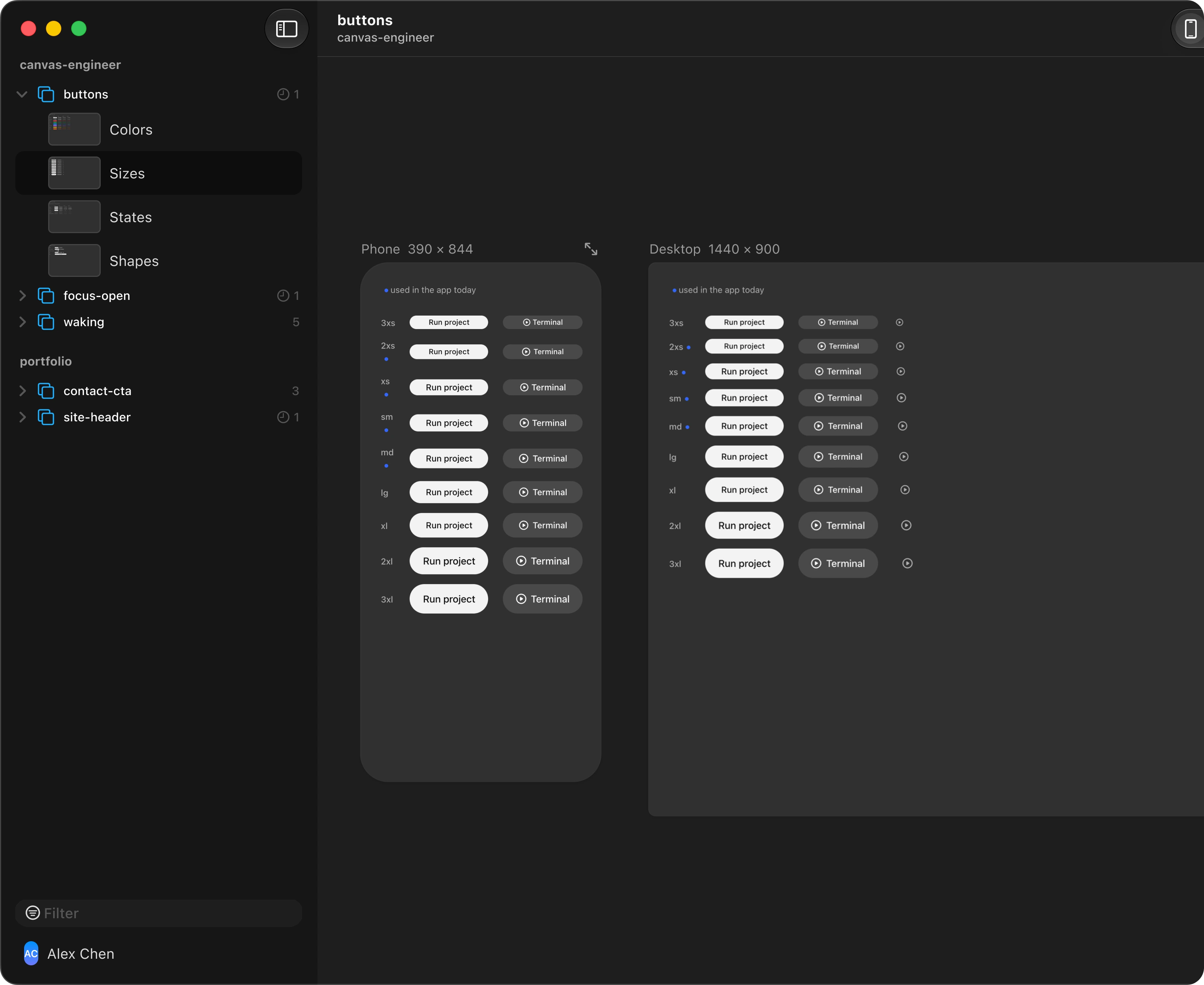
E · Variant selected
ValidateTested
A clickable prototype before any code
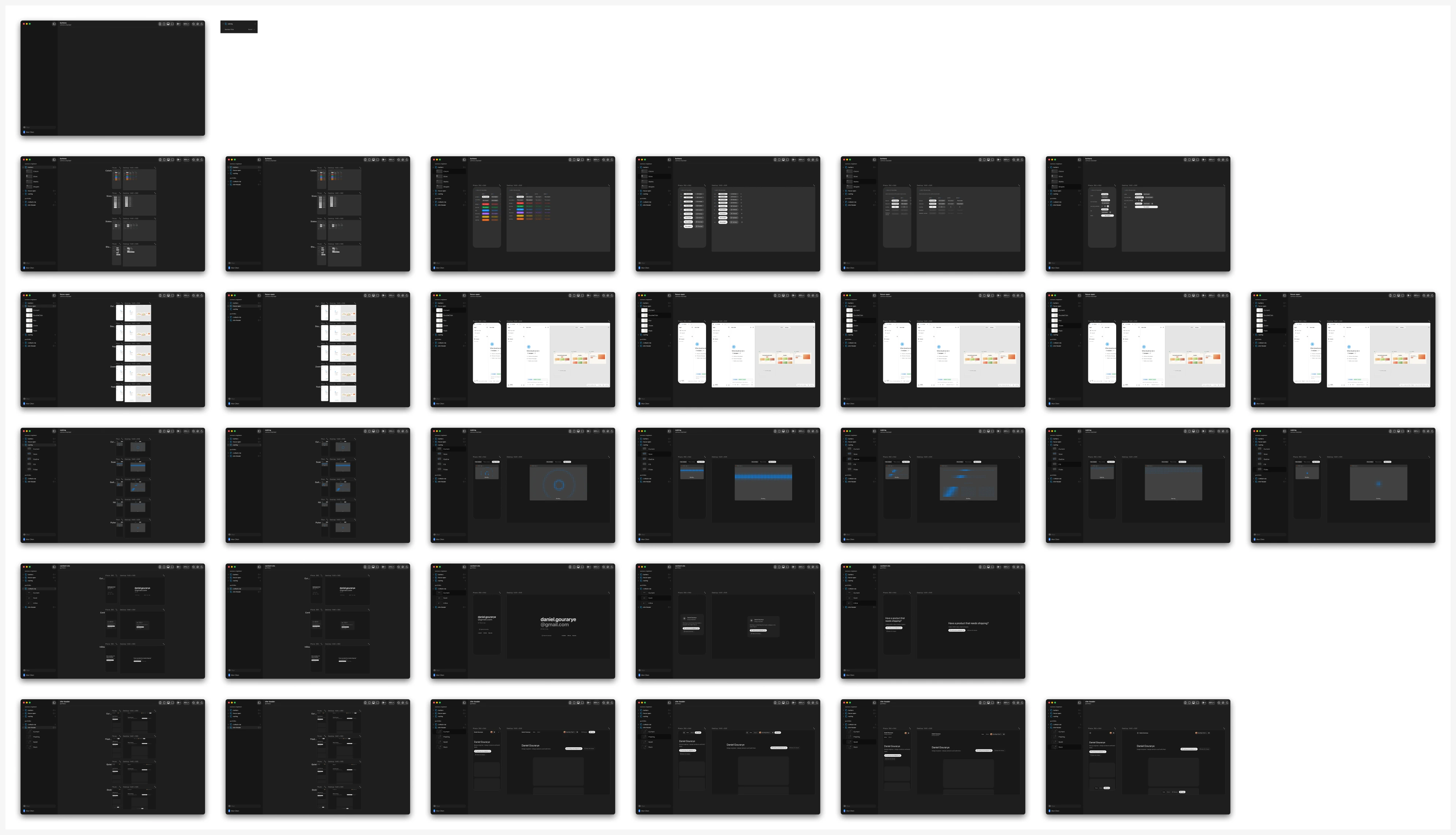
Claude built 31 screens with real captures and 396 hotspots, so the sidebar could be tried in Figma first. I chose E over the toolbar menu once it was built.
Trade-offHard call
The toolbar menu goes
Choosing E meant removing the variant menu entirely. Nesting snapshots would have added a third sidebar level, so they moved into the title menu, with a count on the prototype row.
FixDidn't work
Blank thumbnails
The first thumbnails were taken as soon as a page loaded, before it rendered, so most came out as one flat color. They now wait until the stage reports it has settled.

Taken at load: 1 color
After the stage settles: 330+ colors
ShipShipped in 0.5.0
Variants in the sidebar
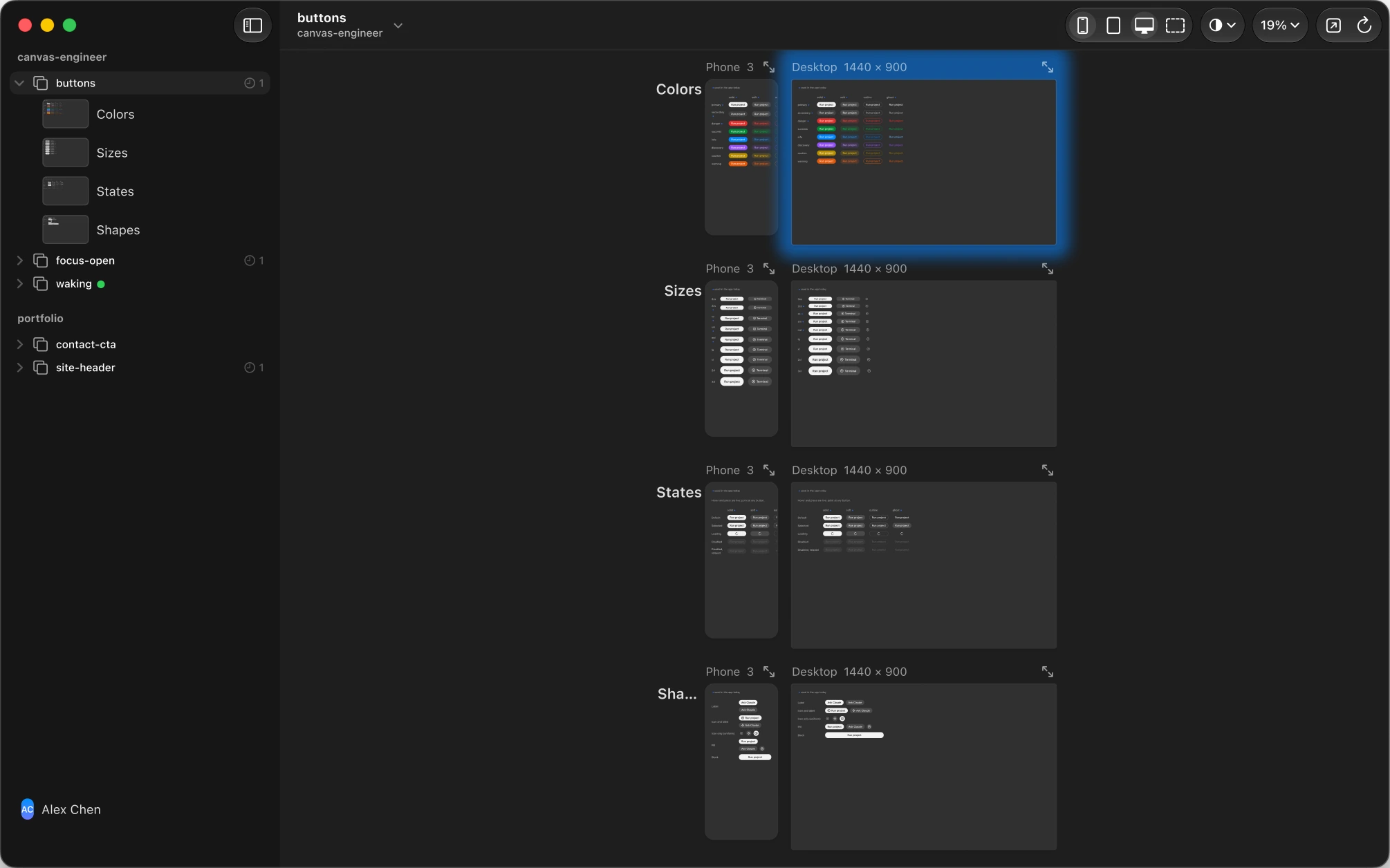
Every variant is a row with a thumbnail, in canvas order. Picking one hides the other rows without a reload.
Not measured yet
The usage log records rendered frames and previews, but not which variant was picked, so this change has no before and after. Logging a variant pick would make the next change to the sidebar measurable.
Who did what
My part
Asked for sidebar directions. Favored D, then suggested combining C with D. Chose E once the clickable prototype was built.
Claude's part
Built the segmented control and the menu, the four directions and option E in Figma, the 31-screen prototype, and the code. Found why the thumbnails were blank.
How it was decided
Direction from me, options from Claude, and a clickable prototype to settle it before any code was written.
Variants moved out of a menu and into the sidebar
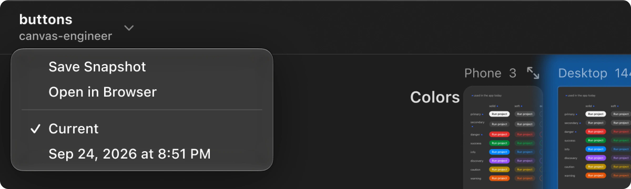
A prototype in Sneak Peek holds several variants, and comparing them is the point of the app. In 0.4 they sat behind an All variants button in the toolbar, while the sidebar only counted them. Seeing what existed took a click, and switching took two.
Before0.4.0
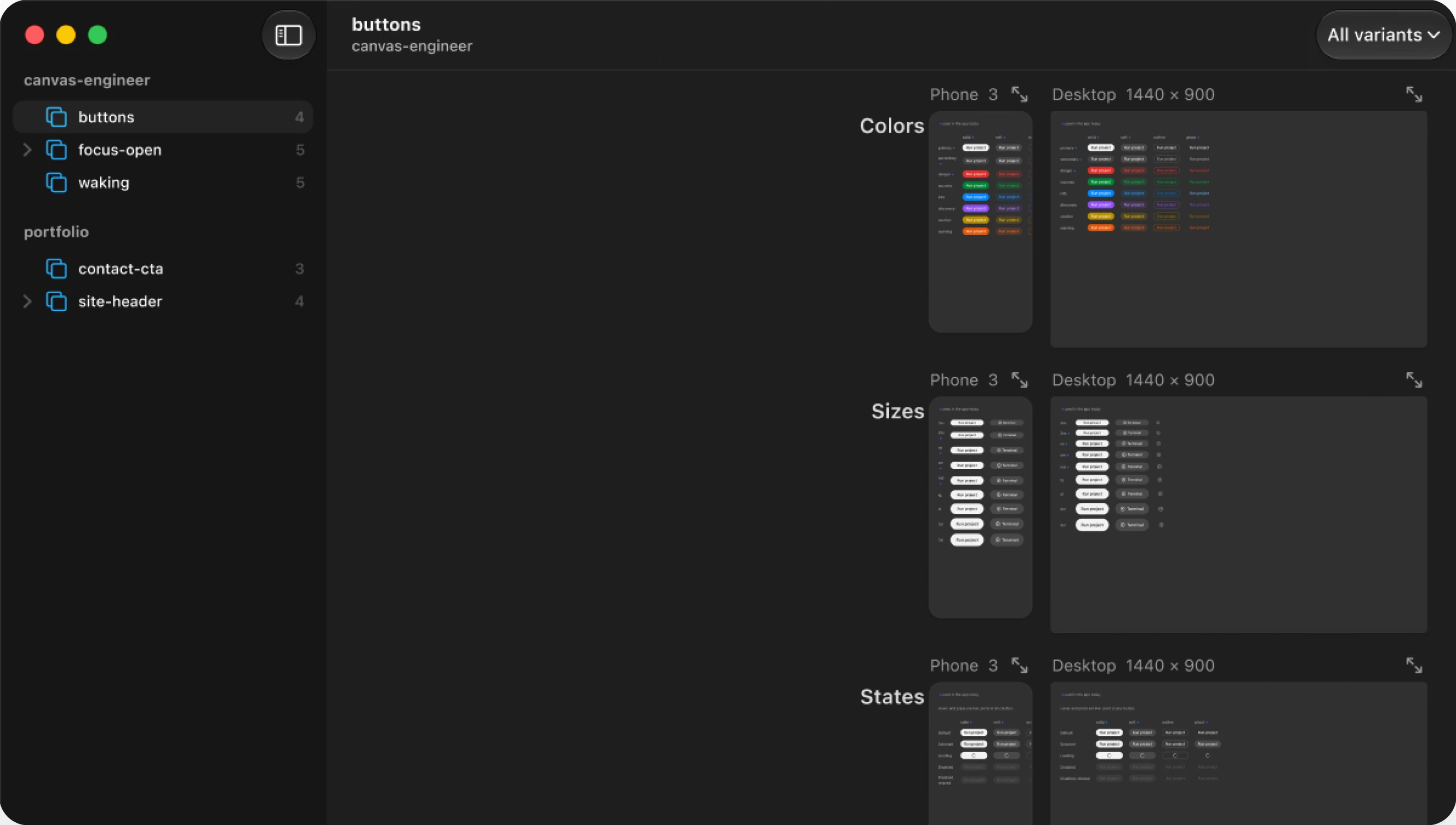
A count, not a list
Each row said how many variants a prototype had, never which ones.
Hidden behind a pop-up
It replaced a segmented control that outgrew the toolbar, and hid the variants along the way.
A · Search and recents
B · Live status
C · Variants as rows
D · Previews
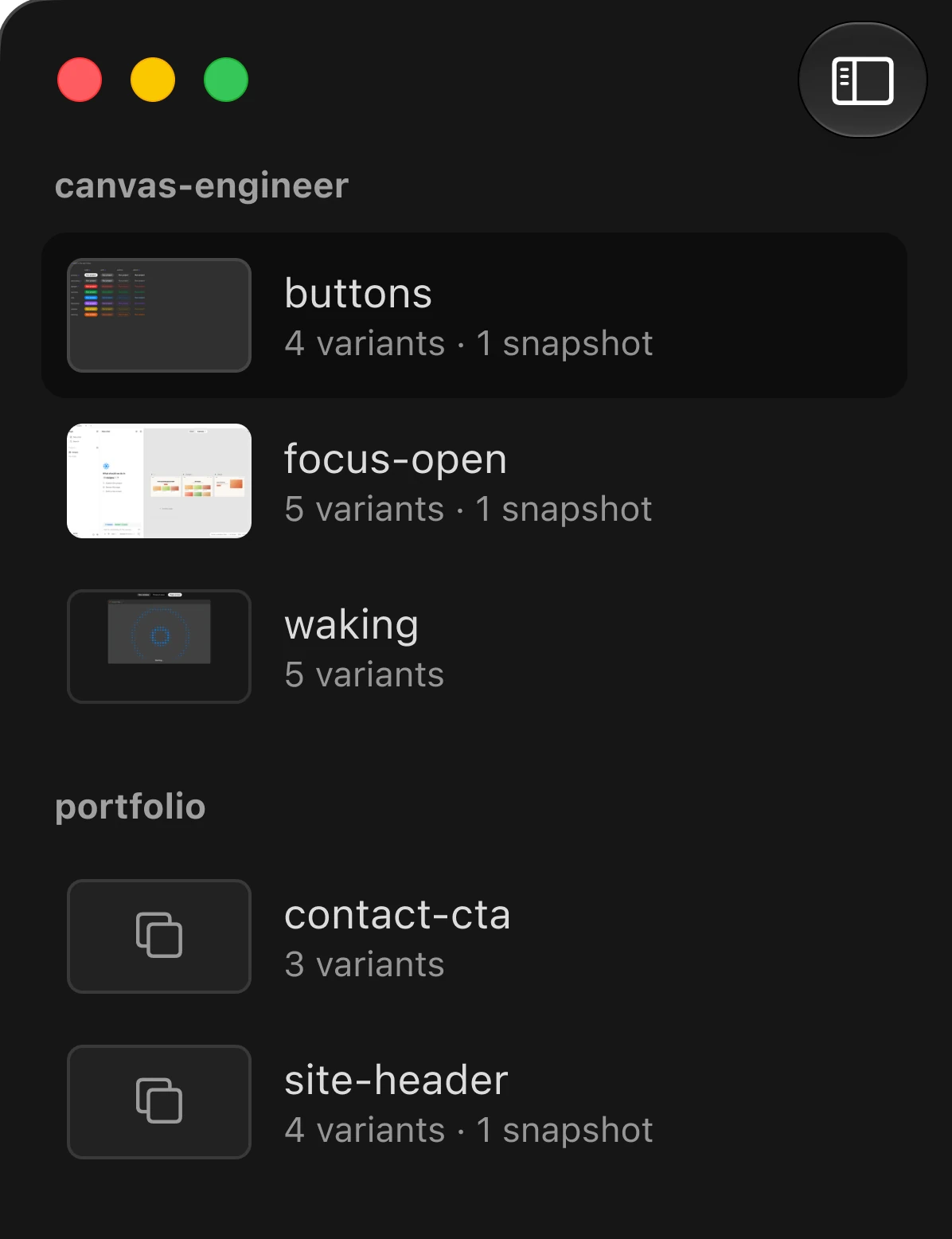
The decision
None of the four, well. I took the rows from C and the previews from D: a prototype stays one compact row, and its variants open under it as thumbnails, so you can tell them apart before you click. Search and live status help you find and monitor. The problem was comparing. The toolbar menu is gone.
After0.5.0
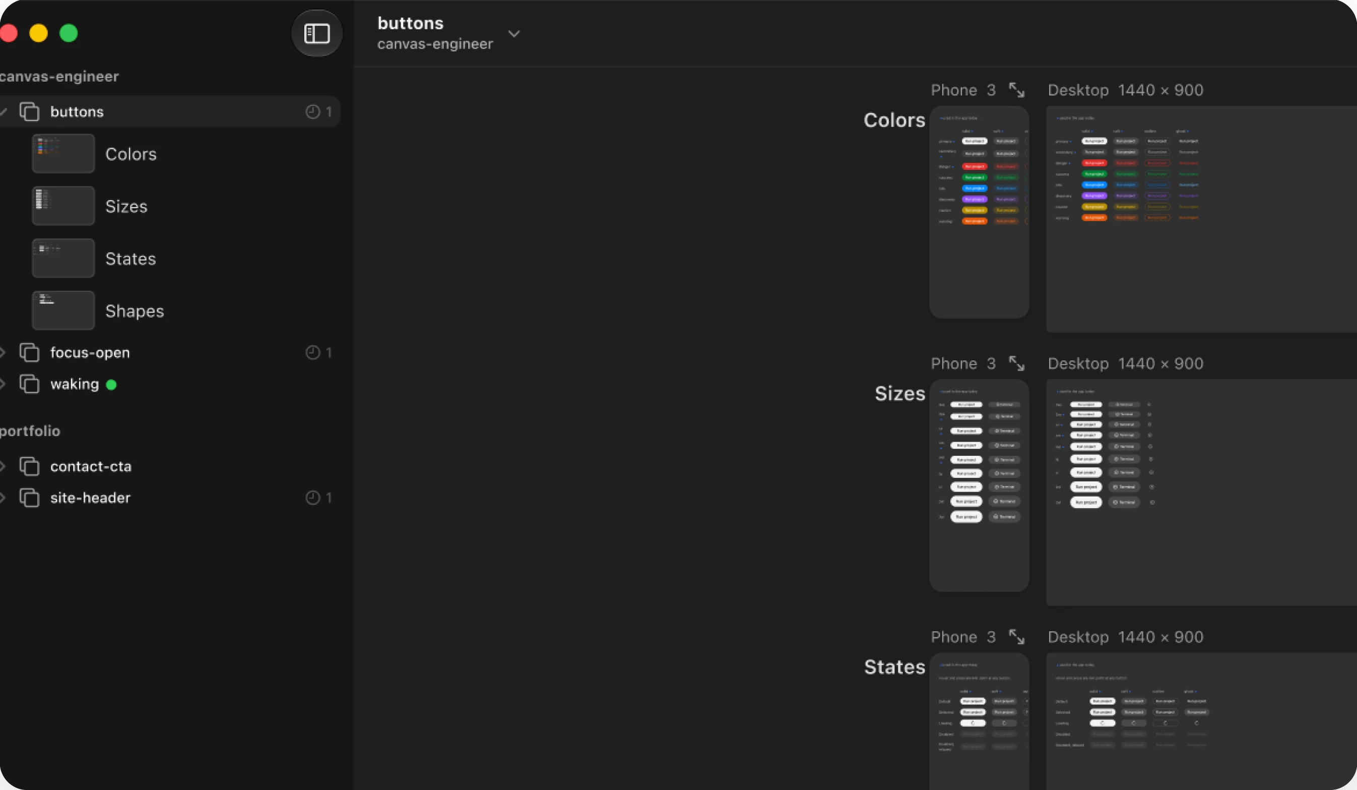
Every variant in view
Variants nest under their prototype as rows, each with a thumbnail taken from its frame on the canvas.
In canvas order
Rows follow the canvas from top to bottom, and picking one hides the other rows without a reload.
Design review: a preview that stays in the window
Opening a variant used to mean a new full-screen window and a switch of Space.
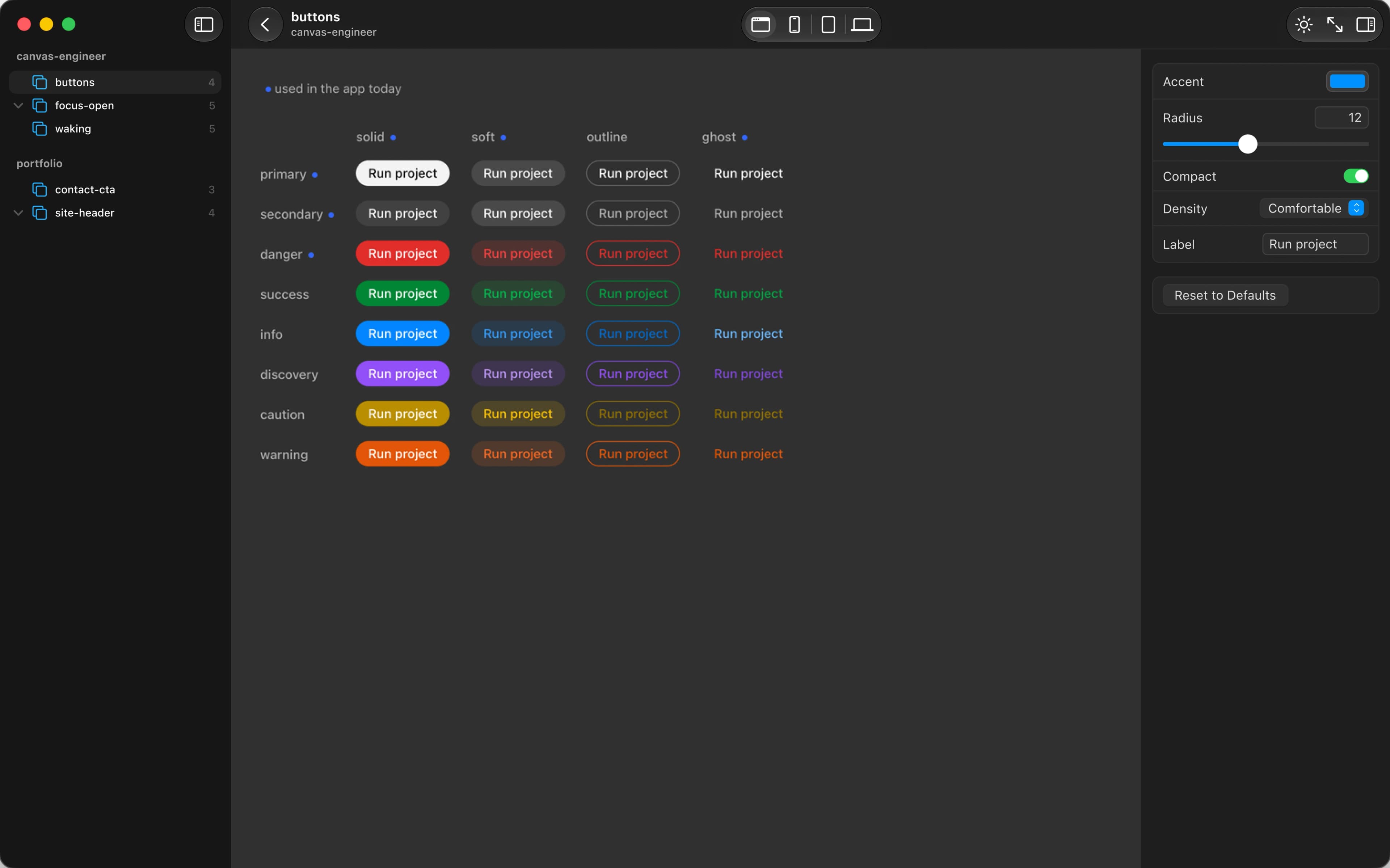
The preview fills the same window and the canvas stays loaded underneath, so Esc returns at once. Controls sit in a native inspector beside the design, not over it.
Design review: pointing instead of describing
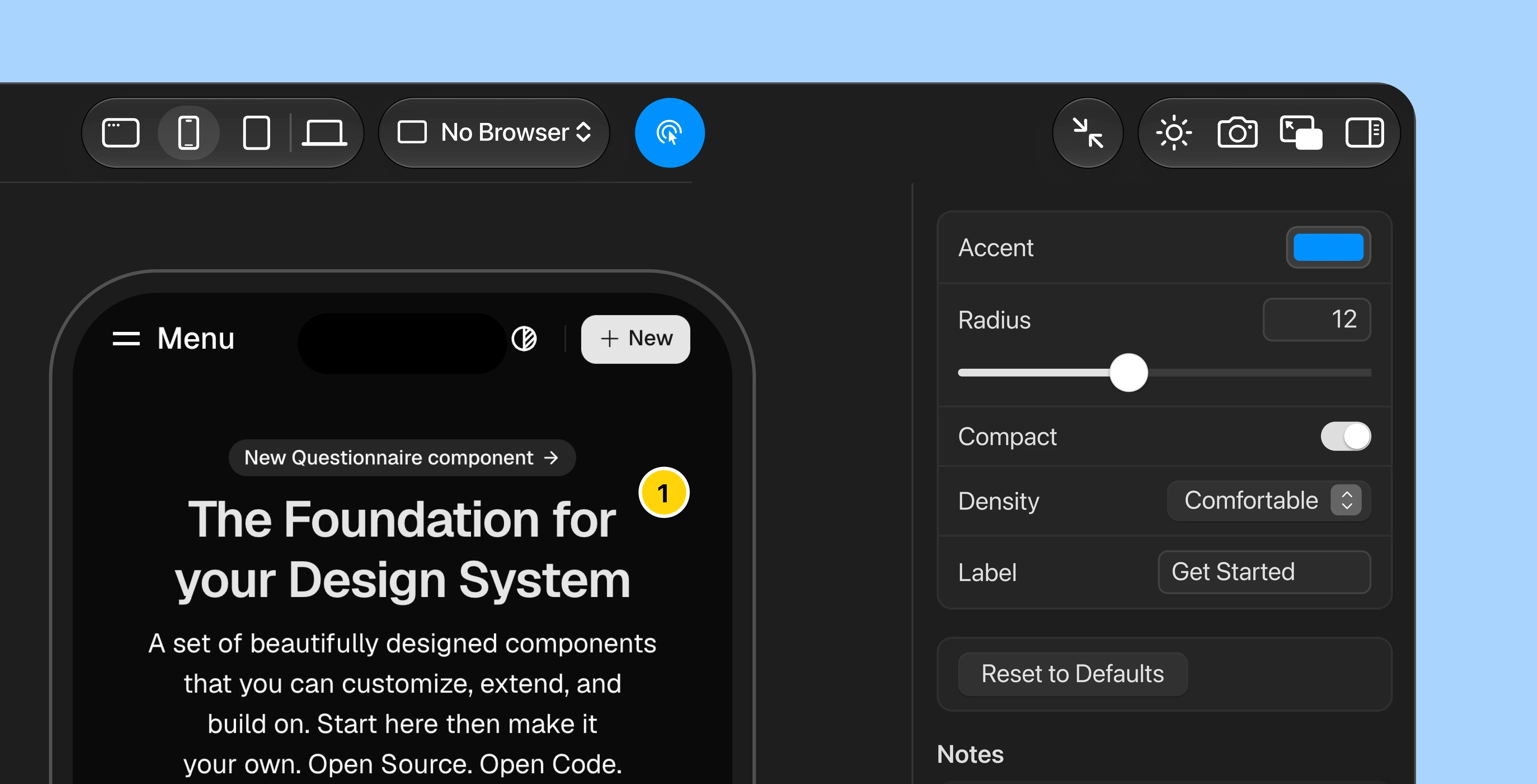
Describing an element to an agent in words kept failing. Select lets you point at it.
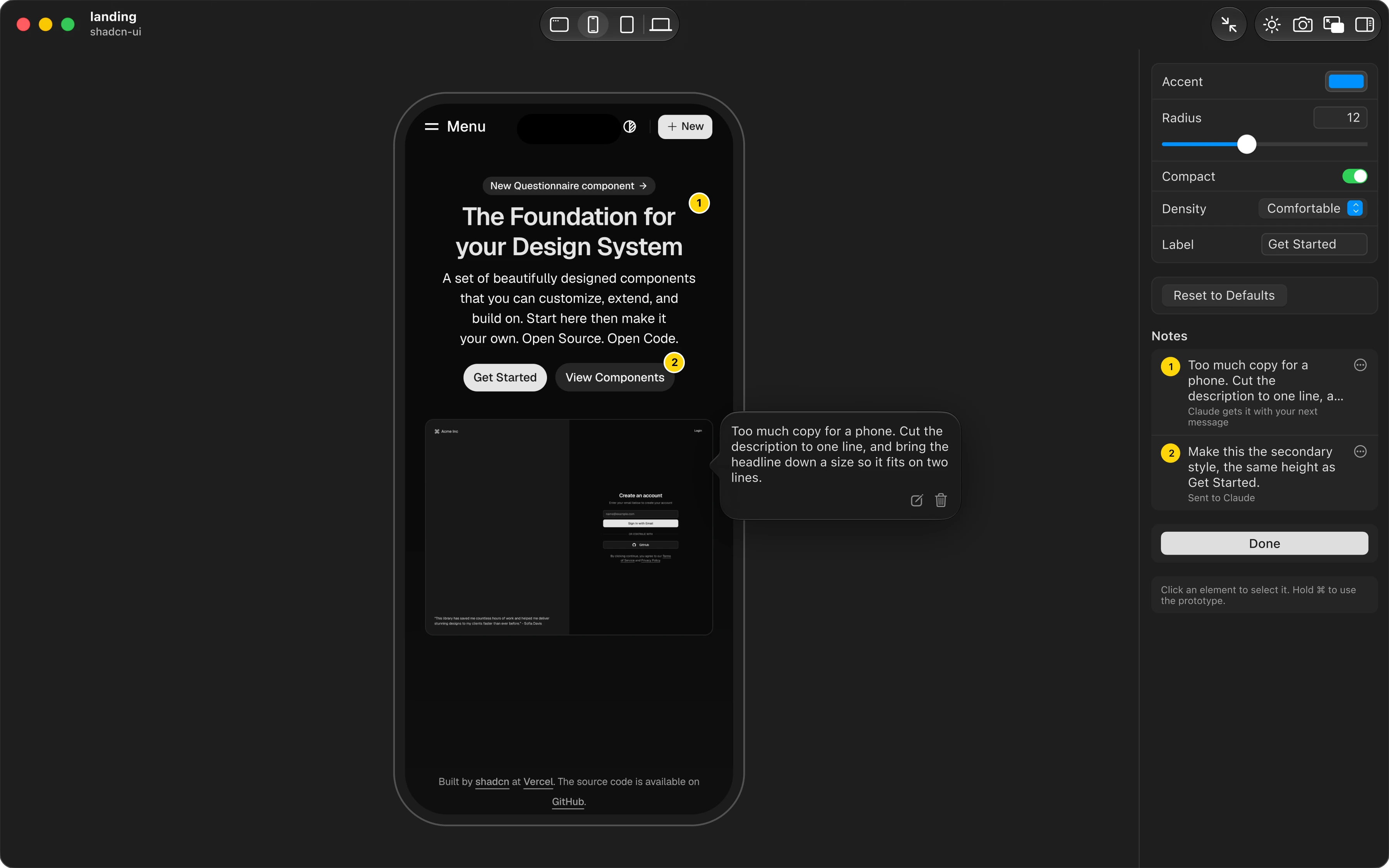
A click on a pin opens its note. Each note is a numbered pin on its element and a row in the inspector.
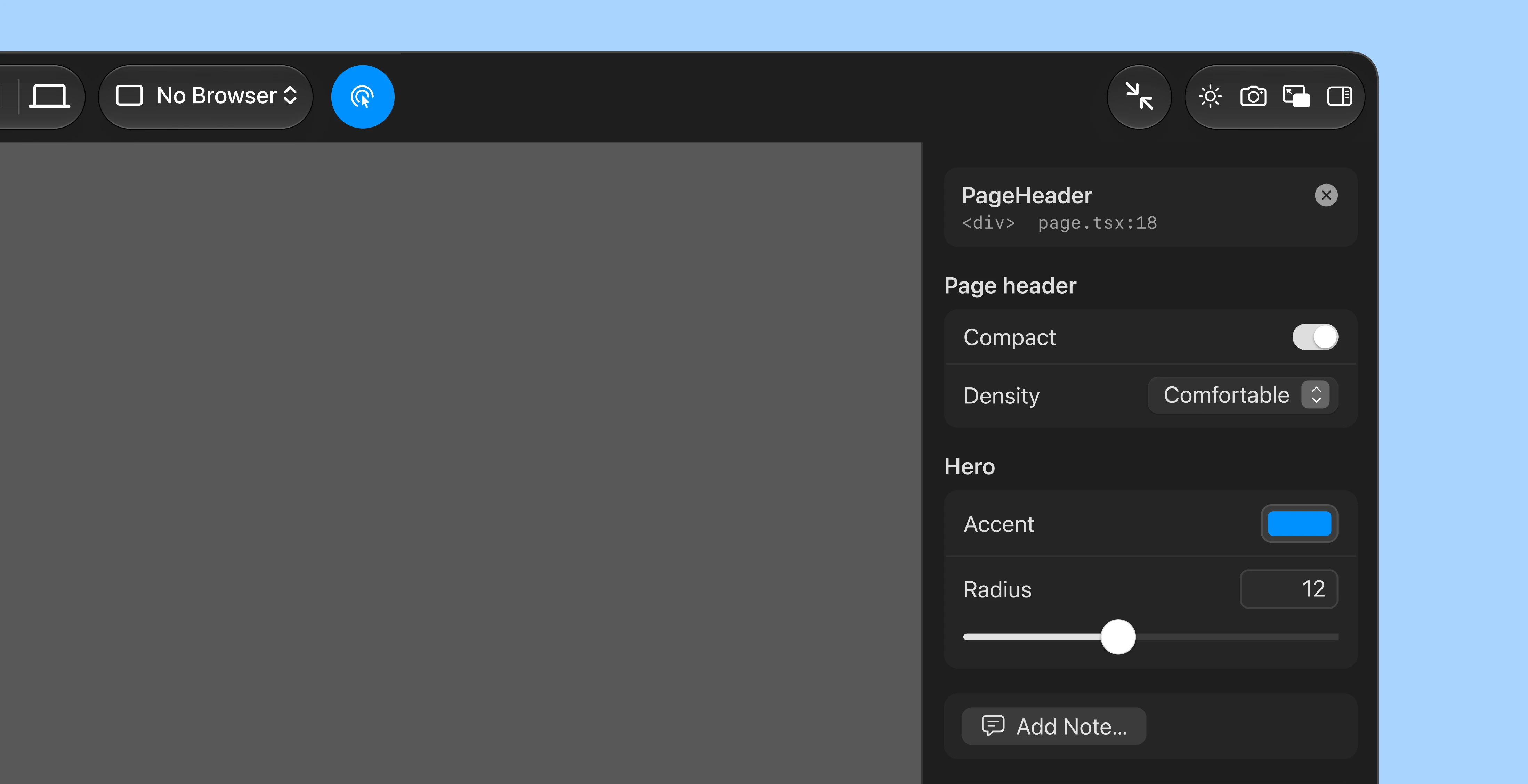
Pick an element and the inspector names it: the component, the tag, and the line of code it came from. Its controls and Add Note sit right under it.
The note becomes a numbered pin on the element, and the agent gets it with that line of code.

The calmest option. But nothing says the note can be edited or deleted, so both actions are things you must already know.
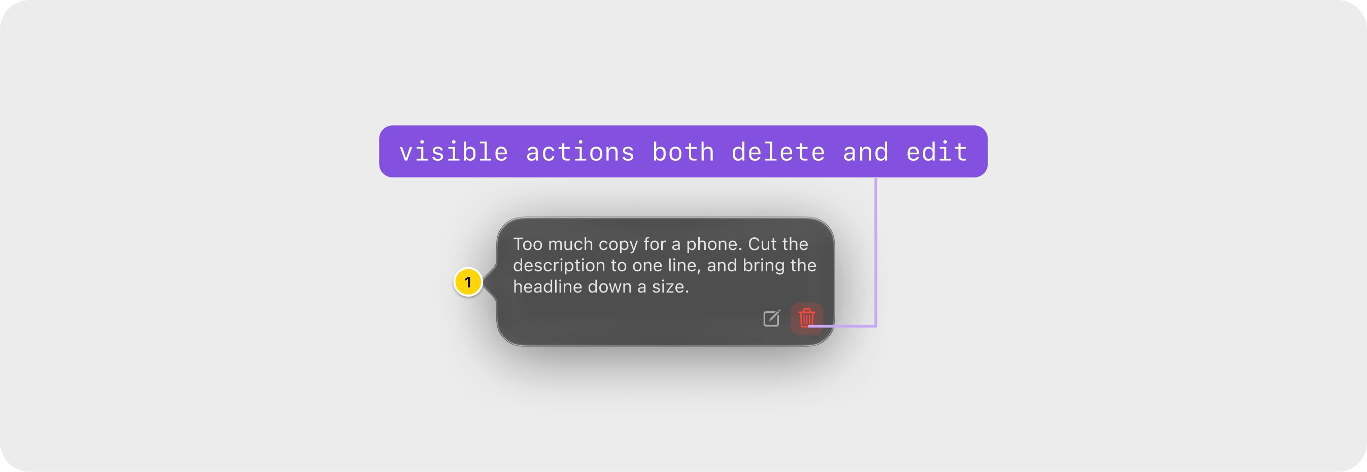
Shipped. Both actions are one click away and easy to find. Two quiet icons cost little room, and Delete turns red only under the pointer.

Edit is the common action, so only it shows. Delete moves to the context menu: safer, but harder to find.
The decision
I shipped the second. A note is something you come back to: you fix its wording, or remove it once the agent has handled it. So both actions stay in view, as two gray icons that keep the note itself the main thing. Its status moved out to the inspector row.
What is still open
The parts I have not solved.
- No outside user has saved a prototype
- Controls and Terminal share one column
- Designers still meet a terminal
- Measure the 0.8 first run
 WhatsApp