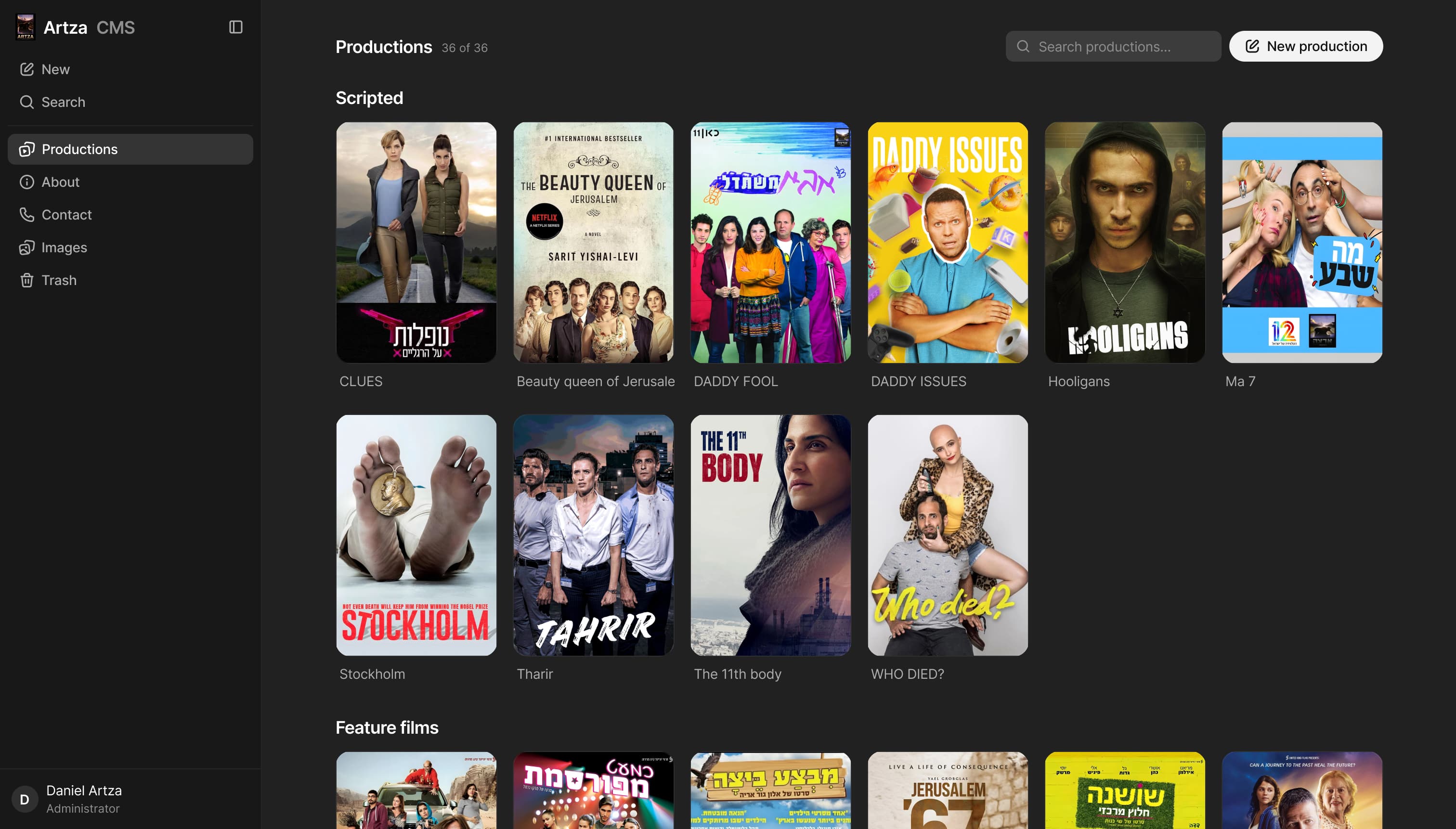
ARTZA CMS case study
A production CMS for the Artza site, built so the team ships a new production without ever opening the code, and can't publish a page that's missing a field.
Product Design & Engineering, 2026
 https://cms-artza-en.vercel.app/
Tech stack
- TypeScript
- Sanity
- Radix UI
- Next.js
The CMS runs as a standalone prototype — publishing is a no-op, so there is nothing you can break. It is a desktop tool though, so it needs a wider screen than this one:
The Goal Wasn’t Growth
Sometimes, as product designers, the goal is not to increase conversion rates, revenue, or monthly active users.
Sometimes, the goal is to take everything we know about product thinking and use it to create an interface that simply feels better to work with.
In this case, the CMS was designed to reduce friction, shorten the learning curve, and make publishing content feel less like operating an internal system.
If I had to define one KPI for this case study, it would be:
- A generic CMS
- ~10 min
- Artza CMS
- ~6 min
Measured over one production page end to end: cover, synopsis, trailer, broadcasters, gallery, and ordering.
Learning From Existing Products
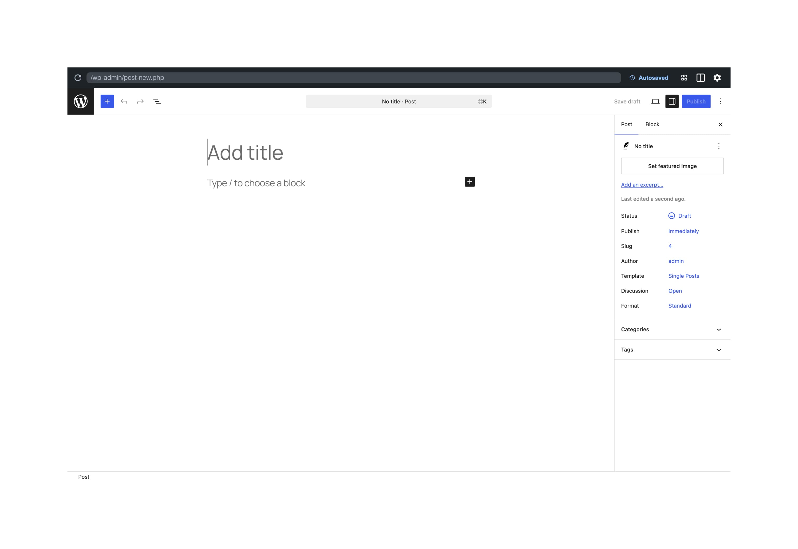
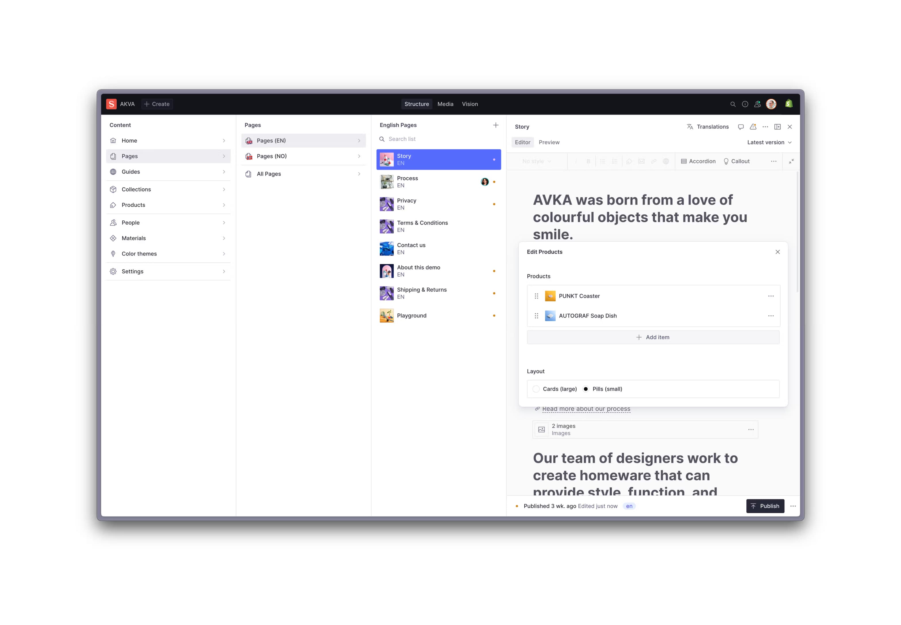
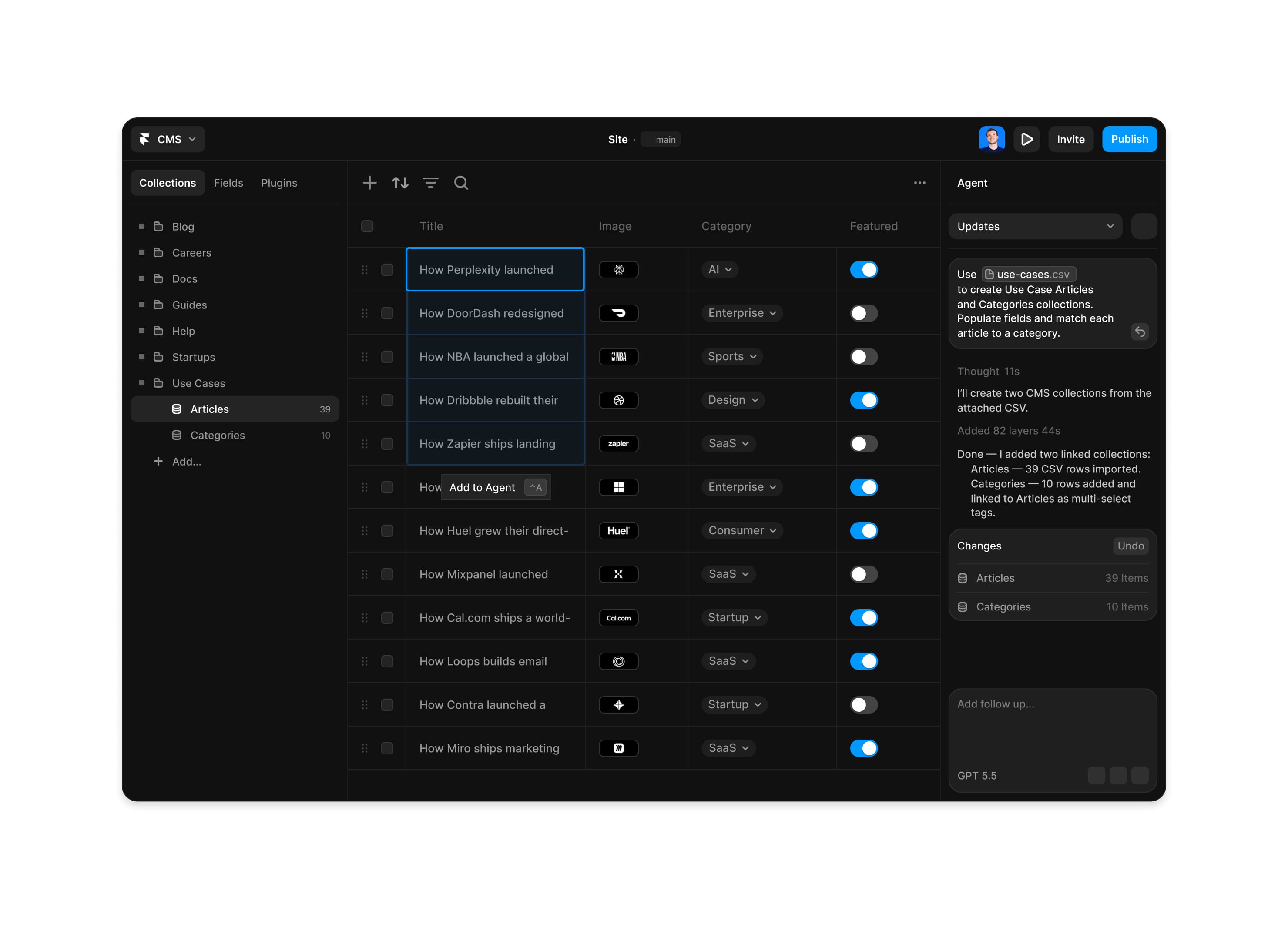
Before designing the interface, I collected examples from existing CMS products to understand what already works, which patterns users recognize, and where the common frustrations begin.
My inspiration library included:
WordPress Studio
Shopify CMS
Sanity Studio
Framer CMS
HubSpot CMS
The goal was not to copy one system, but to identify useful patterns across all of them.
- WordPress Studio
- Shopify CMS
- Sanity Studio
- Framer CMS
- HubSpot CMS
Defining the Editing Experience
The next step was to break the editing experience into individual components.
Each content type was examined based on the information it contained and the action the user needed to perform.
For every component, I asked:
What information does the user need to see?
What is the most important element?
Which fields belong together?
What can be simplified?
Where does the user need additional context?
What should feel visual rather than technical?
This helped transform the CMS from one long generic form into a collection of focused editing experiences.
Structure Before Surface
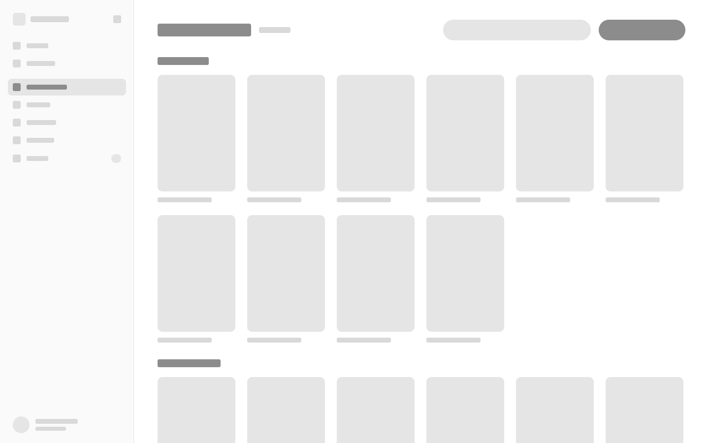
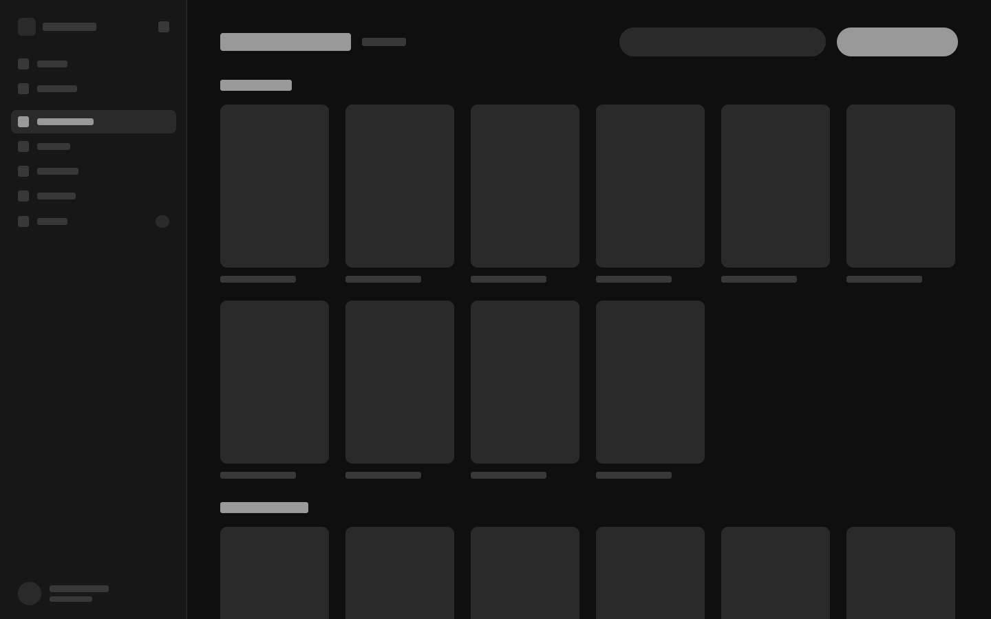
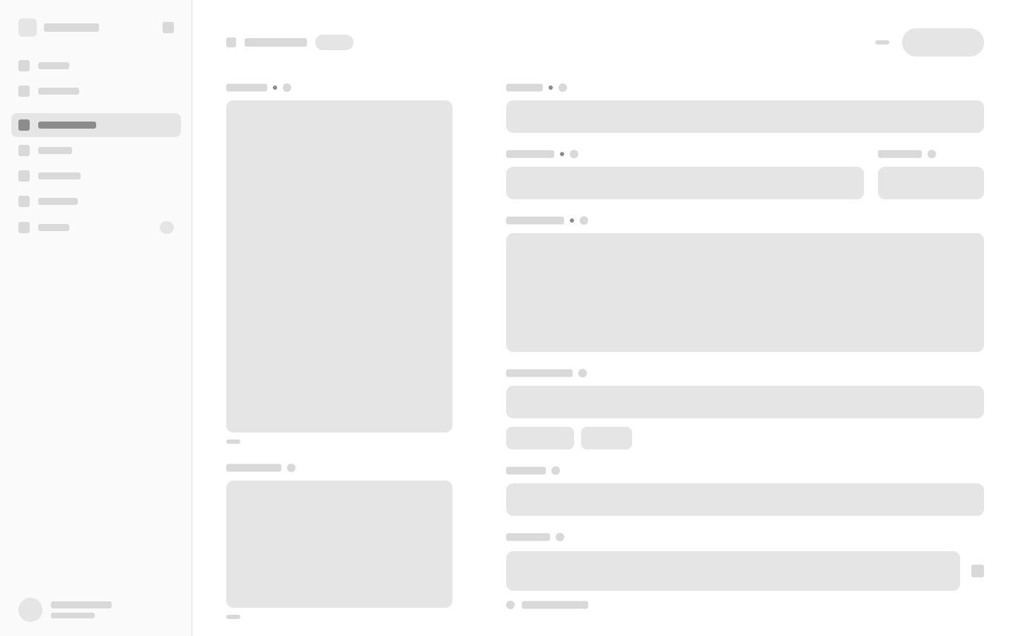
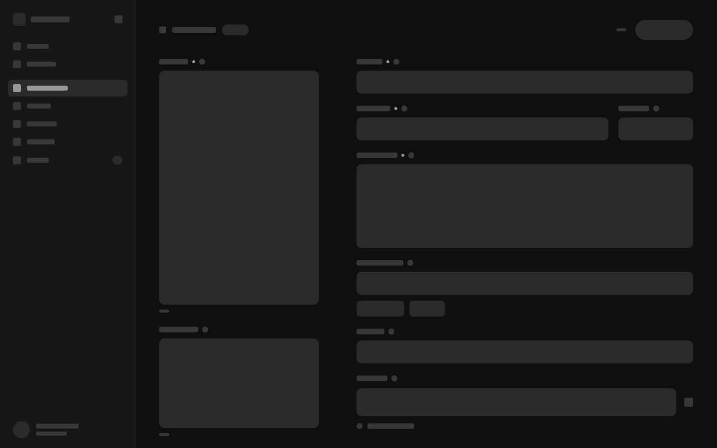
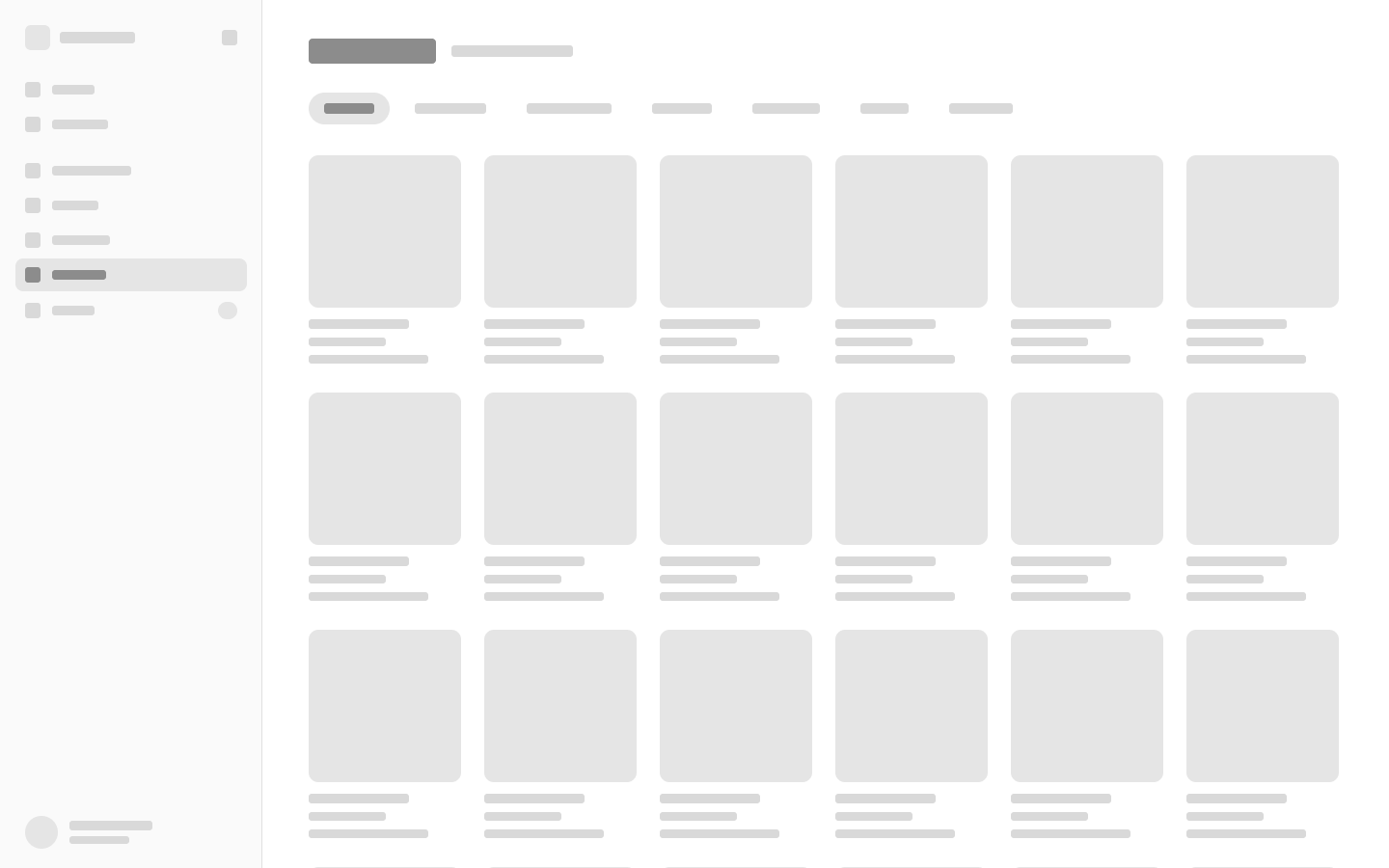
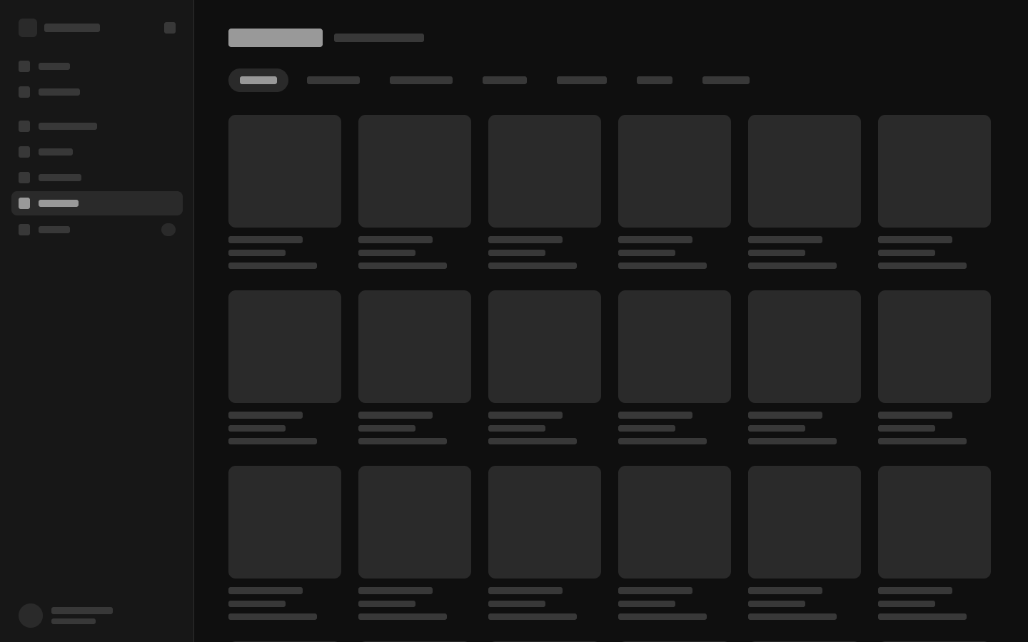
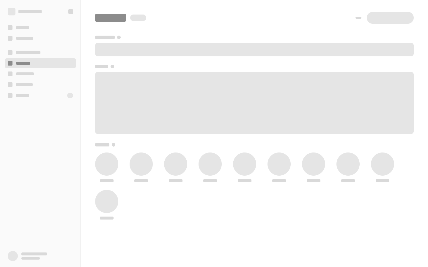
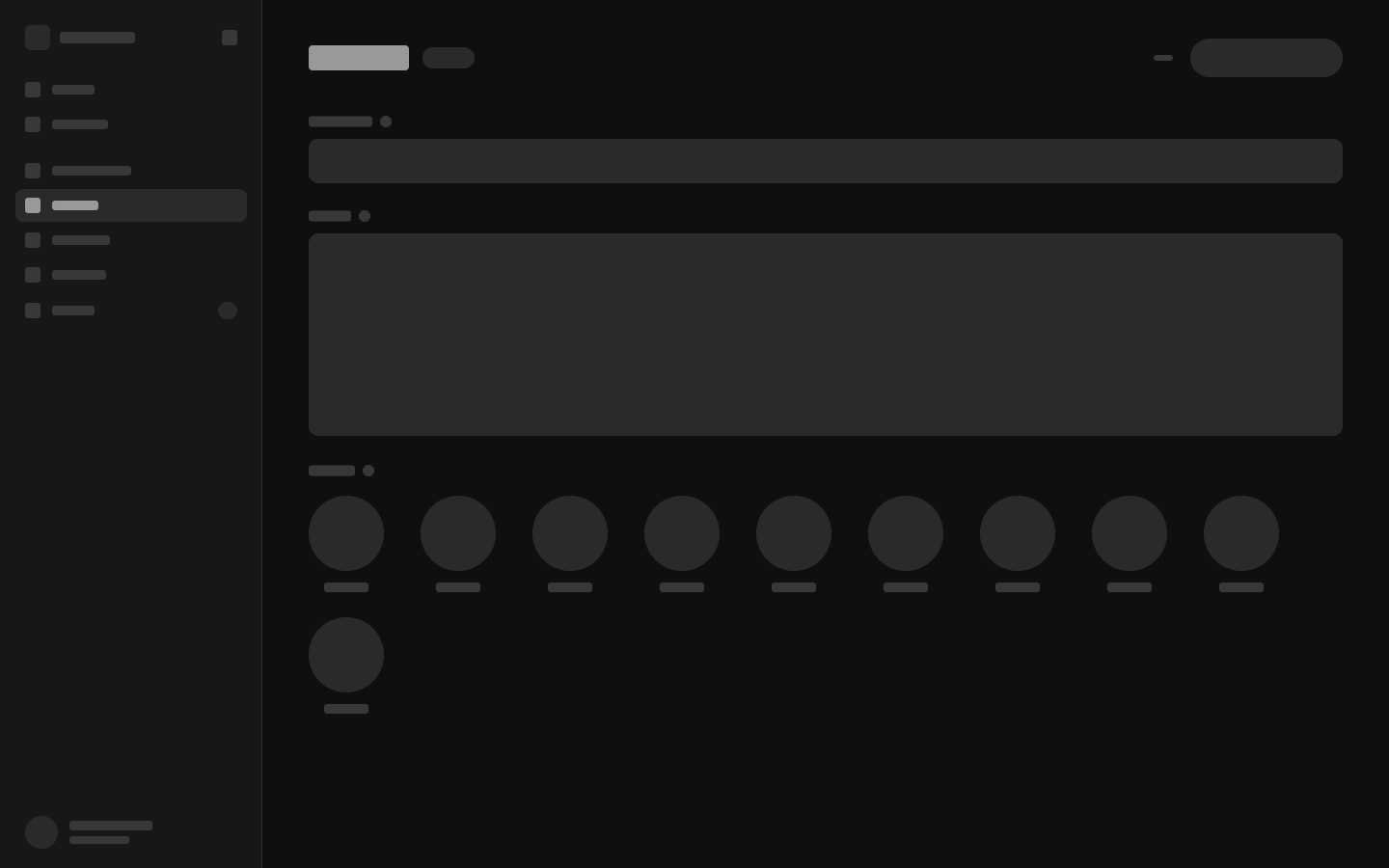
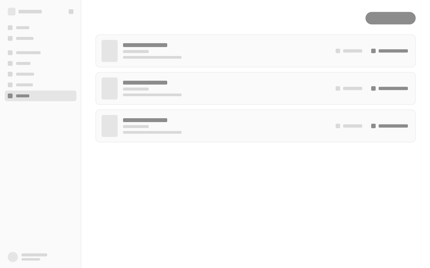
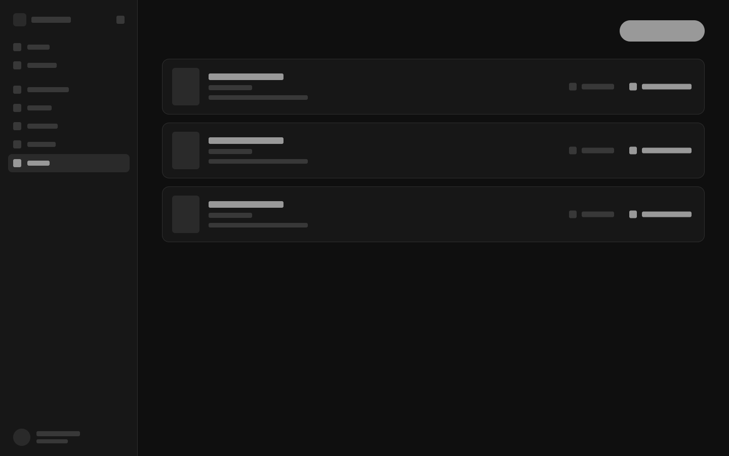
Before any of it looked like anything, every screen was drawn as structure alone.
No copy, no posters, no colour — only the hierarchy. What sits where, what is primary, and what the eye should reach first.
It is the cheapest place to be wrong. Moving a field group in a wireframe costs a minute; moving it once the interface is built costs a day.
Designing Around the Content
The structure of each component was determined by the content itself.
A title field did not need the same treatment as an image gallery. Selecting a broadcaster required a different interaction than entering a trailer URL. Reordering productions needed to feel direct and visual rather than hidden inside a numeric field.
Instead of applying one form pattern to every type of information, each component was designed around its specific purpose.
The result was an interface where the structure follows the content—not the limitations of a traditional CMS.
Bringing the Website Into the CMS
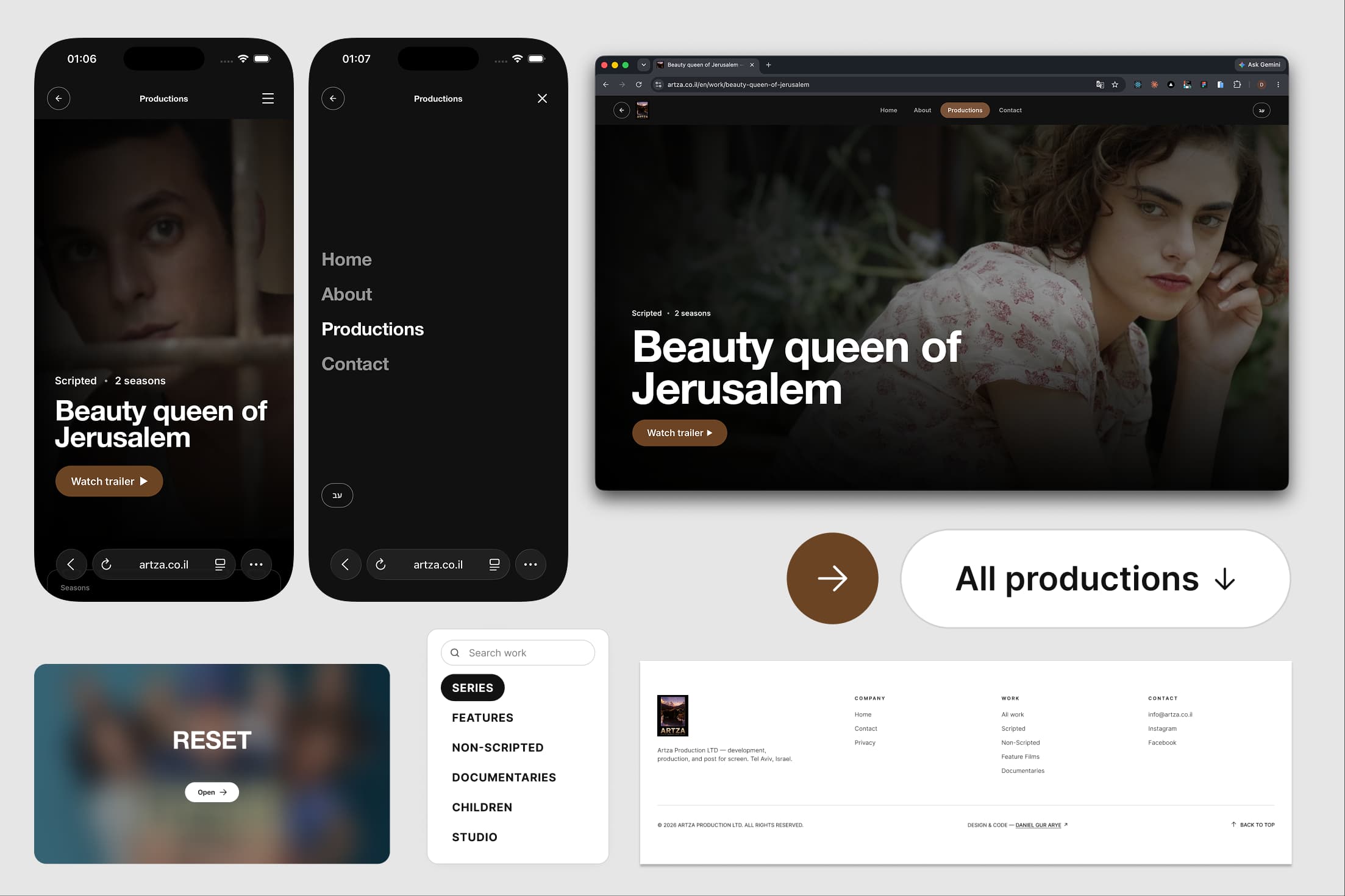
The final design borrowed visual language from the public website.
Images were given more space. Content appeared in familiar proportions. Editing controls were placed close to the elements they affected, and technical details were hidden unless they were necessary.
The CMS was no longer treated as a separate back-office product.
It became an extension of the website itself.
That was the central idea behind the experience:
Users should not have to imagine what they are editing. They should feel like they are already working inside the final product.
 WhatsApp